class: center, middle, title-slide .title[ # Color scales ] .author[ ### Claus O. Wilke ] .date[ ### last updated: 2023-01-23 ] --- # Uses of color in data visualization -- <table style = "border: none; line-height: 2.5;"> <tr style = "background: white;"> <td style = "text-align: left; width: 50%;"> 1. Distinguish categories (qualitative) </td> <td> <img src = "color-scales_files/qualitative.png" width = 100% style = "text-align: right; vertical-align: middle"></img> </td> </tr> </table> --- # Qualitative scale example .center.nogap[ <!-- --> ] Palette name: Okabe-Ito ??? Figure redrawn from [Claus O. Wilke. Fundamentals of Data Visualization. O'Reilly, 2019.](https://clauswilke.com/dataviz) --- # Qualitative scale example .center.nogap[ <!-- --> ] Palette name: ColorBrewer Set1 ??? Figure redrawn from [Claus O. Wilke. Fundamentals of Data Visualization. O'Reilly, 2019.](https://clauswilke.com/dataviz) --- # Qualitative scale example .center.nogap[ <!-- --> ] Palette name: ColorBrewer Set3 ??? Figure redrawn from [Claus O. Wilke. Fundamentals of Data Visualization. O'Reilly, 2019.](https://clauswilke.com/dataviz) --- # Uses of color in data visualization <table style = "border: none; line-height: 2.5;"> <tr style = "background: white;"> <td style = "text-align: left; width: 50%;"> 1. Distinguish categories (qualitative) </td> <td> <img src = "color-scales_files/qualitative.png" width = 100% style = "text-align: right; vertical-align: middle"></img> </td> </tr> <tr style = "background: white;"> <td style = "text-align: left;"> 2. Represent numeric values (sequential) </td> <td> <img src = "color-scales_files/sequential.png" width = 100% style = "text-align: right; vertical-align: middle"></img> </td> </tr> </table> --- # Sequential scale example <br> .center[ <!-- --> ] Palette name: Viridis ??? Figure redrawn from [Claus O. Wilke. Fundamentals of Data Visualization. O'Reilly, 2019.](https://clauswilke.com/dataviz) --- # Sequential scale example <br> .center[ <!-- --> ] Palette name: Inferno ??? Figure redrawn from [Claus O. Wilke. Fundamentals of Data Visualization. O'Reilly, 2019.](https://clauswilke.com/dataviz) --- # Sequential scale example <br> .center[ <!-- --> ] Palette name: Cividis ??? Figure redrawn from [Claus O. Wilke. Fundamentals of Data Visualization. O'Reilly, 2019.](https://clauswilke.com/dataviz) --- # Uses of color in data visualization <table style = "border: none; line-height: 2.5;"> <tr style = "background: white;"> <td style = "text-align: left; width: 50%;"> 1. Distinguish categories (qualitative) </td> <td> <img src = "color-scales_files/qualitative.png" width = 100% style = "text-align: right; vertical-align: middle"></img> </td> </tr> <tr style = "background: white;"> <td style = "text-align: left;"> 2. Represent numeric values (sequential) </td> <td> <img src = "color-scales_files/sequential.png" width = 100% style = "text-align: right; vertical-align: middle"></img> </td> </tr> <tr style = "background: white;"> <td style = "text-align: left;"> 3. Represent numeric values (diverging) </td> <td> <img src = "color-scales_files/diverging.png" width = 100% style = "text-align: right; vertical-align: middle"></img> </td> </tr> </table> --- # Diverging scale example .center.nogap[ <!-- --> ] Palette name: ColorBrewer PiYG ??? Figure redrawn from [Claus O. Wilke. Fundamentals of Data Visualization. O'Reilly, 2019.](https://clauswilke.com/dataviz) --- # Diverging scale example .center.nogap[ <!-- --> ] Palette name: Carto Earth ??? Figure redrawn from [Claus O. Wilke. Fundamentals of Data Visualization. O'Reilly, 2019.](https://clauswilke.com/dataviz) --- # Diverging scale example .center.nogap[ <!-- --> ] Palette name: Blue-Red ??? Figure redrawn from [Claus O. Wilke. Fundamentals of Data Visualization. O'Reilly, 2019.](https://clauswilke.com/dataviz) --- # Uses of color in data visualization <table style = "border: none; line-height: 2.5;"> <tr style = "background: white;"> <td style = "text-align: left; width: 50%;"> 1. Distinguish categories (qualitative) </td> <td> <img src = "color-scales_files/qualitative.png" width = 100% style = "text-align: right; vertical-align: middle;"></img> </td> </tr> <tr style = "background: white;"> <td style = "text-align: left;"> 2. Represent numeric values (sequential) </td> <td> <img src = "color-scales_files/sequential.png" width = 100% style = "text-align: right; vertical-align: middle"></img> </td> </tr> <tr style = "background: white;"> <td style = "text-align: left;"> 3. Represent numeric values (diverging) </td> <td> <img src = "color-scales_files/diverging.png" width = 100% style = "text-align: right; vertical-align: middle"></img> </td> </tr> <tr style = "background: white;"> <td style = "text-align: left;"> 4. Highlight </td> <td> <img src = "color-scales_files/highlight.png" width = 100% style = "text-align: right; vertical-align: middle"></img> </td> </tr> </table> --- # Highlight example .center[ <!-- --> ] Palette name: Grays with accents ??? Figure redrawn from [Claus O. Wilke. Fundamentals of Data Visualization. O'Reilly, 2019.](https://clauswilke.com/dataviz) --- # Highlight example .center[ <!-- --> ] Palette name: Okabe-Ito accent ??? Figure redrawn from [Claus O. Wilke. Fundamentals of Data Visualization. O'Reilly, 2019.](https://clauswilke.com/dataviz) --- # Highlight example .center[ <!-- --> ] Palette name: ColorBrewer accent ??? Figure redrawn from [Claus O. Wilke. Fundamentals of Data Visualization. O'Reilly, 2019.](https://clauswilke.com/dataviz) --- # Uses of color in data visualization <table style = "border: none; line-height: 2.5;"> <tr style = "background: white;"> <td style = "text-align: left; width: 50%;"> 1. Distinguish categories (qualitative) </td> <td> <img src = "color-scales_files/qualitative.png" width = 100% style = "text-align: right; vertical-align: middle;"></img> </td> </tr> <tr style = "background: white;"> <td style = "text-align: left;"> 2. Represent numeric values (sequential) </td> <td> <img src = "color-scales_files/sequential.png" width = 100% style = "text-align: right; vertical-align: middle"></img> </td> </tr> <tr style = "background: white;"> <td style = "text-align: left;"> 3. Represent numeric values (diverging) </td> <td> <img src = "color-scales_files/diverging.png" width = 100% style = "text-align: right; vertical-align: middle"></img> </td> </tr> <tr style = "background: white;"> <td style = "text-align: left;"> 4. Highlight </td> <td> <img src = "color-scales_files/highlight.png" width = 100% style = "text-align: right; vertical-align: middle"></img> </td> </tr> </table> [//]: # "segment ends here" --- class: center middle ## Color scales in **ggplot2** --- ## Getting the data The `temps_months` dataset: .tiny-font[ ```r temps_months <- read_csv("https://wilkelab.org/DSC385/datasets/tempnormals.csv") %>% group_by(location, month_name) %>% summarize(mean = mean(temperature)) %>% mutate( month = factor( month_name, levels = c("Jan", "Feb", "Mar", "Apr", "May", "Jun", "Jul", "Aug", "Sep", "Oct", "Nov", "Dec") ), location = factor( location, levels = c("Death Valley", "Houston", "San Diego", "Chicago") ) ) %>% select(-month_name) ``` ] --- ## Getting the data The `popgrowth` dataset: .tiny-font[ ```r US_census <- read_csv("https://wilkelab.org/DSC385/datasets/US_census.csv") US_regions <- read_csv("https://wilkelab.org/DSC385/datasets/US_regions.csv") popgrowth <- left_join(US_census, US_regions) %>% group_by(region, division, state) %>% summarize( pop2000 = sum(pop2000, na.rm = TRUE), pop2010 = sum(pop2010, na.rm = TRUE), popgrowth = (pop2010-pop2000)/pop2000, .groups = "drop" ) %>% mutate(region = factor(region, levels = c("West", "South", "Midwest", "Northeast"))) ``` ] --- ## **ggplot2** color scale functions are a bit of a mess -- .small-font.center[ Scale function | Aesthetic | Data type | Palette type :----------- | :---------- | :------------ | :------------ `scale_color_hue()` | `color` | discrete | qualitative ] --- ## **ggplot2** color scale functions are a bit of a mess .small-font.center[ Scale function | Aesthetic | Data type | Palette type :----------- | :---------- | :------------ | :------------ `scale_color_hue()` | `color` | discrete | qualitative `scale_fill_hue()` | `fill ` | discrete | qualitative ] --- ## **ggplot2** color scale functions are a bit of a mess .small-font.center[ Scale function | Aesthetic | Data type | Palette type :----------- | :---------- | :------------ | :------------ `scale_color_hue()` | `color` | discrete | qualitative `scale_fill_hue()` | `fill ` | discrete | qualitative `scale_color_gradient()` | `color` | continuous | sequential ] --- ## **ggplot2** color scale functions are a bit of a mess .small-font.center[ Scale function | Aesthetic | Data type | Palette type :----------- | :---------- | :------------ | :------------ `scale_color_hue()` | `color` | discrete | qualitative `scale_fill_hue()` | `fill ` | discrete | qualitative `scale_color_gradient()` | `color` | continuous | sequential `scale_color_gradient2()` | `color` | continuous | diverging ] --- ## **ggplot2** color scale functions are a bit of a mess .small-font.center[ Scale function | Aesthetic | Data type | Palette type :----------- | :---------- | :------------ | :------------ `scale_color_hue()` | `color` | discrete | qualitative `scale_fill_hue()` | `fill ` | discrete | qualitative `scale_color_gradient()` | `color` | continuous | sequential `scale_color_gradient2()` | `color` | continuous | diverging `scale_fill_viridis_c()` | `color` | continuous | sequential `scale_fill_viridis_d()` | `fill` | discrete | sequential `scale_color_brewer()` | `color` | discrete | qualitative, diverging, sequential `scale_fill_brewer()` | `fill` | discrete | qualitative, diverging, sequential `scale_color_distiller()` | `color` | continuous | qualitative, diverging, sequential ] ... and there are many many more --- ## Examples .small-font[ ```r ggplot(temps_months, aes(x = month, y = location, fill = mean)) + geom_tile(width = 0.95, height = 0.95) + coord_fixed(expand = FALSE) + theme_classic() # no fill scale defined, default is scale_fill_gradient() ``` ] .center[ <!-- --> ] --- ## Examples .small-font[ ```r ggplot(temps_months, aes(x = month, y = location, fill = mean)) + geom_tile(width = 0.95, height = 0.95) + coord_fixed(expand = FALSE) + theme_classic() + scale_fill_gradient() ``` ] .center[ <!-- --> ] --- ## Examples .small-font[ ```r ggplot(temps_months, aes(x = month, y = location, fill = mean)) + geom_tile(width = 0.95, height = 0.95) + coord_fixed(expand = FALSE) + theme_classic() + scale_fill_viridis_c() ``` ] .center[ <!-- --> ] --- ## Examples .small-font[ ```r ggplot(temps_months, aes(x = month, y = location, fill = mean)) + geom_tile(width = 0.95, height = 0.95) + coord_fixed(expand = FALSE) + theme_classic() + scale_fill_viridis_c(option = "B", begin = 0.15) ``` ] .center[ <!-- --> ] --- ## Examples .small-font[ ```r ggplot(temps_months, aes(x = month, y = location, fill = mean)) + geom_tile(width = 0.95, height = 0.95) + coord_fixed(expand = FALSE) + theme_classic() + scale_fill_distiller(palette = "YlGnBu") ``` ] .center[ <!-- --> ] --- ## The **colorspace** package creates some order Scale name: `scale_<aesthetic>_<datatype>_<colorscale>()` -- .small-font[ - `<aesthetic>`: name of the aesthetic (`fill`, `color`, `colour`) - `<datatype>`: type of variable plotted (`discrete`, `continuous`, `binned`) - `<colorscale>`: type of the color scale (`qualitative`, `sequential`, `diverging`, `divergingx`) ] -- .small-font.center[ Scale function | Aesthetic | Data type | Palette type :----------- | :-------- | :--------- | :------------ `scale_color_discrete_qualitative()` | `color` | discrete | qualitative `scale_fill_continuous_sequential()` | `fill` | continuous | sequential `scale_colour_continous_divergingx()` | `colour` | continuous | diverging ] --- ## Examples .tiny-font[ ```r ggplot(temps_months, aes(x = month, y = location, fill = mean)) + geom_tile(width = 0.95, height = 0.95) + coord_fixed(expand = FALSE) + theme_classic() + scale_fill_continuous_sequential(palette = "YlGnBu", rev = FALSE) ``` ] .center[ <!-- --> ] --- ## Examples .tiny-font[ ```r ggplot(temps_months, aes(x = month, y = location, fill = mean)) + geom_tile(width = 0.95, height = 0.95) + coord_fixed(expand = FALSE) + theme_classic() + scale_fill_continuous_sequential(palette = "Viridis", rev = FALSE) ``` ] .center[ <!-- --> ] --- ## Examples .tiny-font[ ```r ggplot(temps_months, aes(x = month, y = location, fill = mean)) + geom_tile(width = 0.95, height = 0.95) + coord_fixed(expand = FALSE) + theme_classic() + scale_fill_continuous_sequential(palette = "Inferno", begin = 0.15, rev = FALSE) ``` ] .center[ <!-- --> ] --- .tiny-font.nogap[ ```r colorspace::hcl_palettes(type = "sequential", plot = TRUE) # all sequential palettes ``` .center[ <!-- --> ] ] --- .tiny-font.nogap[ ```r colorspace::hcl_palettes(type = "diverging", plot = TRUE, n = 9) # all diverging palettes ``` .center[ <!-- --> ] ] --- .tiny-font.nogap[ ```r colorspace::divergingx_palettes(plot = TRUE, n = 9) # all divergingx palettes ``` .center[ <!-- --> ] ] [//]: # "segment ends here" --- class: center middle ## Setting colors manually for discrete, qualitative scales --- ## Discrete, qualitative scales are best set manually .tiny-font[ ```r ggplot(popgrowth, aes(x = pop2000, y = popgrowth, color = region)) + geom_point() + scale_x_log10() # no color scale defined, default is scale_color_hue() ``` ] .center[ <!-- --> ] --- ## Discrete, qualitative scales are best set manually .tiny-font[ ```r ggplot(popgrowth, aes(x = pop2000, y = popgrowth, color = region)) + geom_point() + scale_x_log10() + scale_color_hue() ``` ] .center[ <!-- --> ] --- ## Discrete, qualitative scales are best set manually .tiny-font[ ```r library(ggthemes) # for scale_color_colorblind() ggplot(popgrowth, aes(x = pop2000, y = popgrowth, color = region)) + geom_point() + scale_x_log10() + scale_color_colorblind() # uses Okabe-Ito colors ``` ] .center[ <!-- --> ] --- ## Discrete, qualitative scales are best set manually .tiny-font[ ```r ggplot(popgrowth, aes(x = pop2000, y = popgrowth, color = region)) + geom_point() + scale_x_log10() + scale_color_manual( values = c(West = "#E69F00", South = "#56B4E9", Midwest = "#009E73", Northeast = "#F0E442") ) ``` ] .center[ <!-- --> ] --- ## Okabe-Ito RGB codes .center[ <img src = "https://clauswilke.com/dataviz/pitfalls_of_color_use_files/figure-html/palette-Okabe-Ito-1.png", width = 100%></img> ] .tiny-font[ 
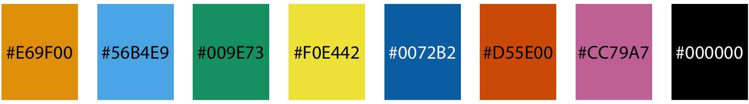
Name | Hex code | R, G, B (0-255) :---------- | :------- | :-------- orange | #E69F00 | 230, 159, 0 sky blue | #56B4E9 | 86, 180, 233 bluish green | #009E73 | 0, 158, 115 yellow | #F0E442 | 240, 228, 66 blue | #0072B2 | 0, 114, 178 vermilion | #D55E00 | 213, 94, 0 reddish purple | #CC79A7 | 204, 121, 167 black | #000000 | 0, 0, 0 ] ??? Figure from [Claus O. Wilke. Fundamentals of Data Visualization. O'Reilly, 2019.](https://clauswilke.com/dataviz) [//]: # "segment ends here" --- ## Further reading - Fundamentals of Data Visualization: [Chapter 4: Color scales](https://clauswilke.com/dataviz/color-basics.html) - Fundamentals of Data Visualization: [Figure 19.10: Okabe-Ito color palette](https://clauswilke.com/dataviz/color-pitfalls.html#fig:palette-Okabe-Ito) - **ggplot2** book: [Colour scales and legends](https://ggplot2-book.org/scale-colour.html) - **ggplot2** reference documentation: [Scales](https://ggplot2.tidyverse.org/reference/index.html#section-scales) - **colorspace** package: [HCL-Based Color Scales for ggplot2](https://colorspace.r-forge.r-project.org/articles/ggplot2_color_scales.html)