| location | day_of_year | month | temperature |
|---|---|---|---|
| Death Valley | 1 | 01 | 51.0 |
| Death Valley | 2 | 01 | 51.2 |
| Death Valley | 3 | 01 | 51.3 |
| Death Valley | 4 | 01 | 51.4 |
| Death Valley | 5 | 01 | 51.6 |
| Death Valley | 6 | 01 | 51.7 |
| Death Valley | 7 | 01 | 51.9 |
| Death Valley | 8 | 01 | 52.0 |
| Death Valley | 9 | 01 | 52.2 |
| Death Valley | 10 | 01 | 52.3 |
| Death Valley | 11 | 01 | 52.5 |
| Death Valley | 12 | 01 | 52.7 |
| Death Valley | 13 | 01 | 52.9 |
Aesthetic mappings and the Grammar of Graphics
Claus O. Wilke
2026-01-17
Plots map data onto graphical elements
Dataset:
Daily average temperatures for various locations
Temperatures mapped onto y position
Temperatures mapped onto color
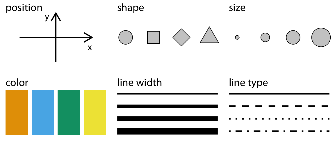
Commonly used aesthetics

The same data values can be mapped to different aesthetics

We can use many different aesthetics at once
The Grammar-of-Graphics pipeline
Creating aesthetic mappings in ggplot
Getting the data
All examples will use the temperatures dataset:
We define the mapping with aes()
We define the mapping with aes()
We frequently omit argument names
Long form, all arguments are named:
The geom determines how the data is shown
The geom determines how the data is shown
The geom determines how the data is shown
The geom determines how the data is shown
Important: Distinguish between color and fill
Distinguish between color and fill
color
Applies color to points, lines, text, borders
fill
Applies color to any filled areas
Many geoms use both color and fill
Many geoms use both color and fill
Many geoms use both color and fill
Aesthetics can also be used as parameters
Aesthetics can also be used as parameters
Further reading
- Fundamentals of Data Visualization: Chapter 2: Visualizing data
- Data Visualization—A Practical Introduction: Chapter 3: Make a plot
- ggplot2 reference documentation
- ggplot2 book
- ggplot2 cheatsheet