Animations
2025-04-16
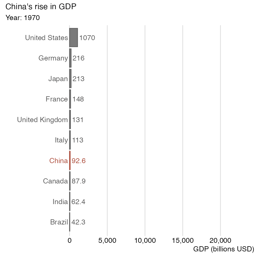
Animations can create more engaging displays
Data source: World Bank
We make animations in R with gganimate
The gganimate package adds powerful animation tools to ggplot2
Think of an animation as faceting by time

We know how to make a faceted plot

Making an animation is about as complicated
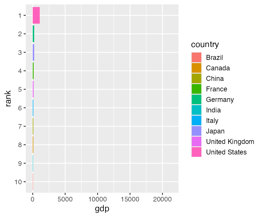
Adding country names and plot title
gdp_ranked |>
  ggplot(aes(gdp, rank, group = country)) +
  geom_col(aes(fill = country)) +
  geom_text(
    aes(x = -200, label = country),
    hjust = 1, size = 14/.pt
  ) +
  xlim(-7000, 23000) +
  labs(title = "year: {closest_state}") +
  theme_minimal_vgrid(14, rel_small = 1) +
  theme(
    axis.text.y = element_blank(),
    axis.title.y = element_blank(),
    axis.ticks.y = element_blank(),
    axis.line.y = element_blank()
  ) +
  guides(fill = "none") +
  transition_states(year, transition_length = 5)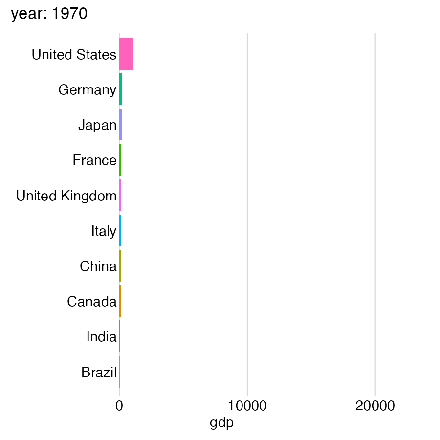
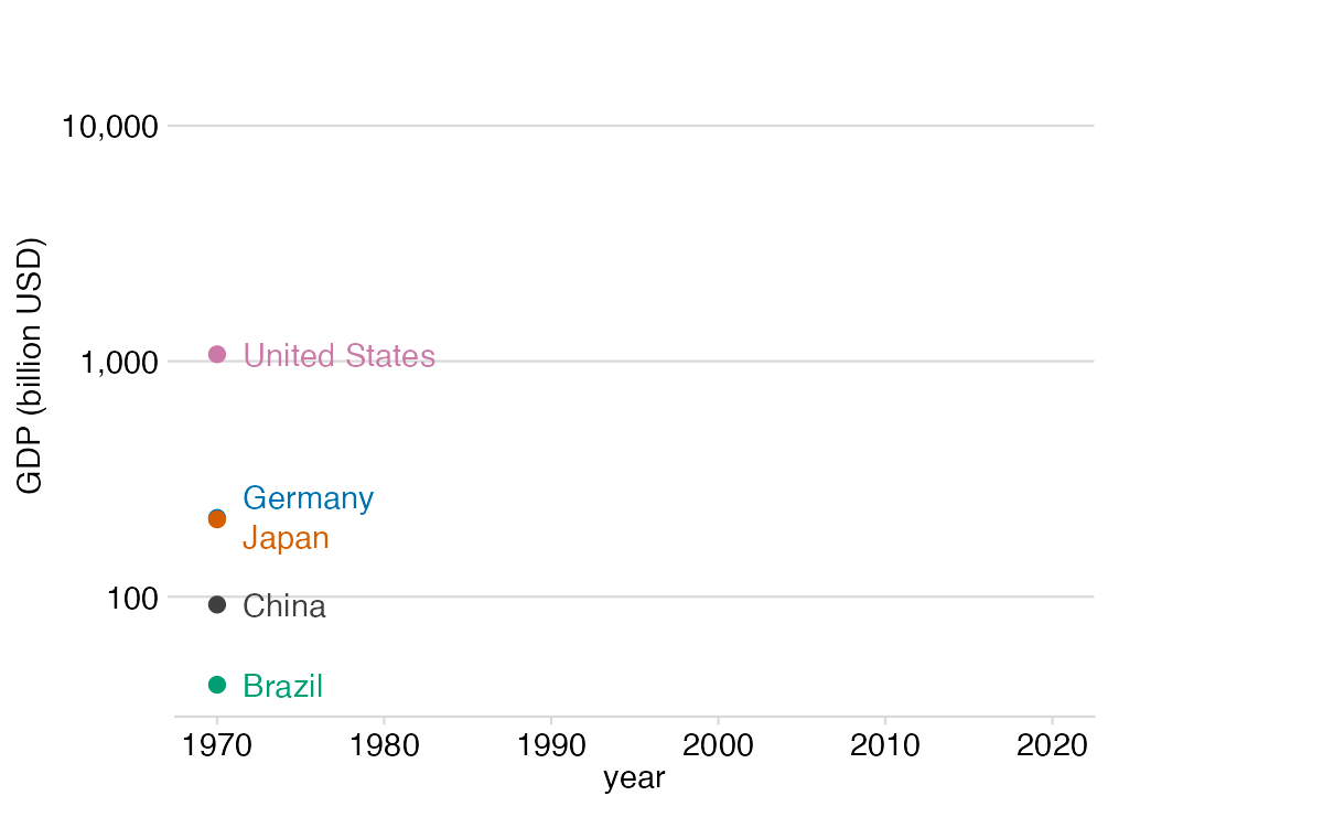
We make time series with transition_reveal()
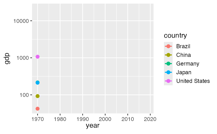
This works also with ggrepel for labeling
gdp_ranked |>
  filter(country %in% selected) |>
  ggplot(aes(year, gdp, color = country)) +
  geom_line() +
  geom_point(size = 3) +
  geom_text_repel(
    aes(label = country),
    hjust = 0,
    nudge_x = 2,
    direction = "y",
    xlim = c(NA, Inf),
    segment.color = NA
  ) +
  scale_y_log10() +
  guides(color = "none") +
  coord_cartesian(clip = "off") +
  theme(plot.margin = margin(7, 100, 7, 7)) +
  transition_reveal(year)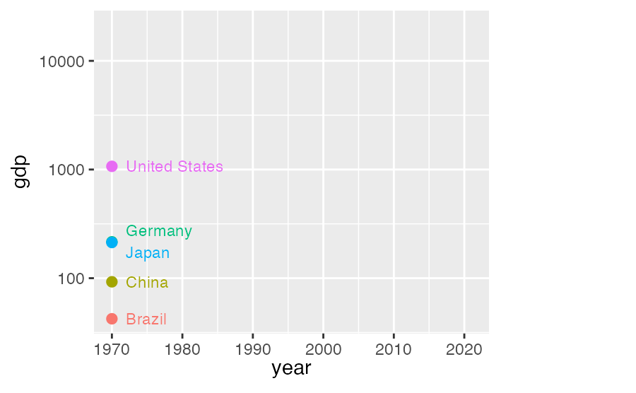
Reproducing the famous gapminder animation
library(gapminder)

gapminder %>% filter(continent != "Oceania") |>
  ggplot() +
  aes(gdpPercap, lifeExp, size = pop) +
  geom_point(alpha = 0.7, color = "#0072B2") +
  scale_size(range = c(2, 12), guide = "none") +
  scale_x_log10(name = "GDP per capita") +
  facet_wrap(~continent, nrow = 2) +
  labs(
    title = "Year: {frame_time}",
    y = "life expectancy"
  ) +
  transition_time(year) +
  ease_aes("linear")
See Hans Rosling video here