
Visualizing proportions
2025-02-10
Pie chart vs stacked bars vs side-by-side bars

Pie chart vs stacked bars vs side-by-side bars

Pie chart vs stacked bars vs side-by-side bars

Example where side-by-side bars are preferred

Inspired by: https://en.wikipedia.org/wiki/File:Piecharts.svg
Example where side-by-side bars are preferred

Inspired by: https://en.wikipedia.org/wiki/File:Piecharts.svg
Example where side-by-side bars are preferred

Inspired by: https://en.wikipedia.org/wiki/File:Piecharts.svg
Example where side-by-side bars are preferred

Inspired by: https://en.wikipedia.org/wiki/File:Piecharts.svg
Example where stacked bars are preferred

Change in the gender composition of the Rwandan parliament from 1997 to 2016
Mosaic plots subdivide data along two dimensions
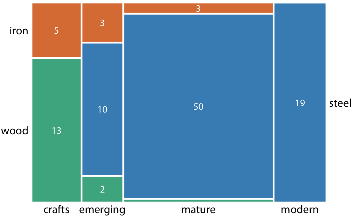
Dataset: Bridges in Pittsburgh by construction material and era of construction
Closely related to mosaic plot: Treemap
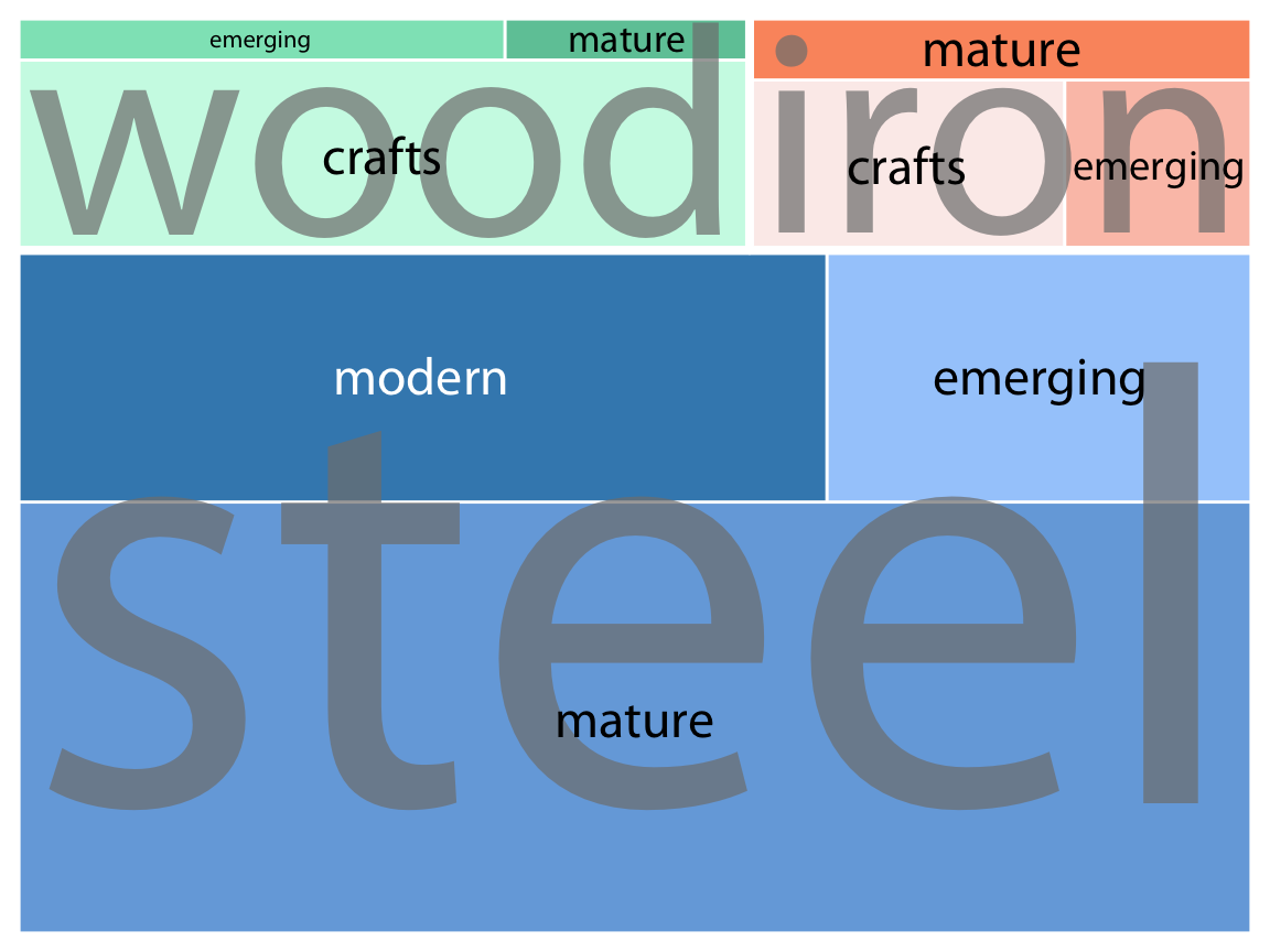
Dataset: Bridges in Pittsburgh by construction material and era of construction
Treemaps work well for more complex cases
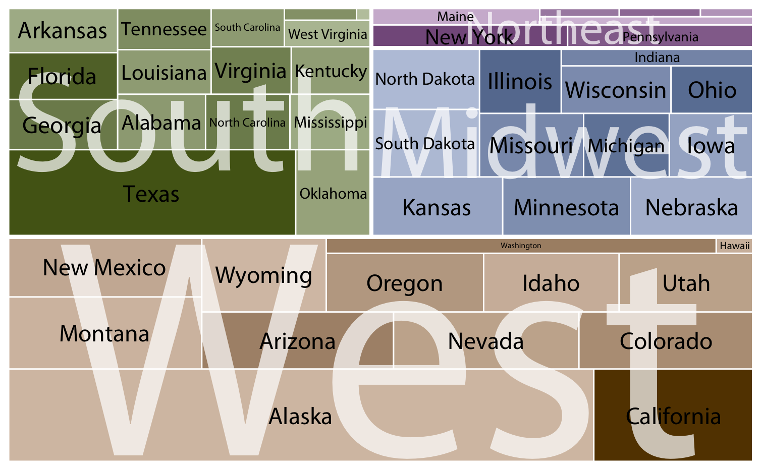
Dataset: Land surface area of US states
We can nest pie charts with clever coloring
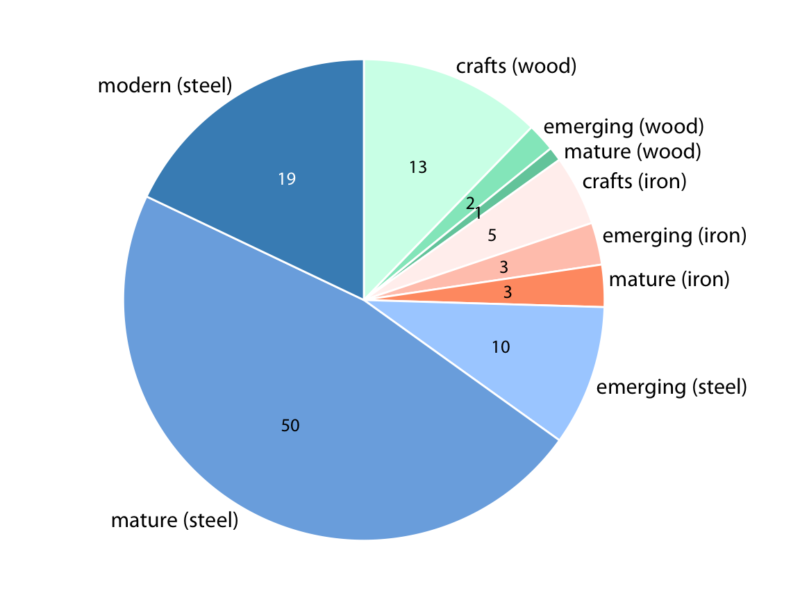
Dataset: Bridges in Pittsburgh by construction material and era of construction
Parallel sets can show many subdivisions at once
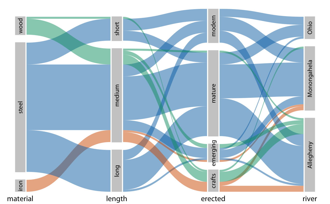
Dataset: Bridges in Pittsburgh by construction material and era of construction
Don’t show nested proportions without nesting!
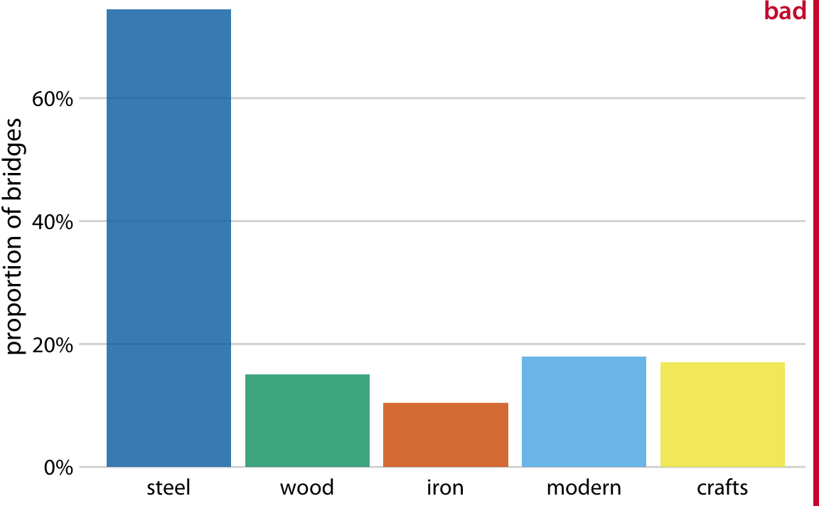
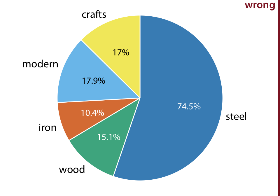
Dataset: Bridges in Pittsburgh by construction material and era of construction
Making pie charts with ggplot2: polar coords

Making pie charts with ggplot2: polar coords

Making pie charts with ggplot2: polar coords
# the data
bundestag <- tibble(
  party = c("CDU/CSU", "SPD", "FDP"),
  seats = c(243, 214, 39)
)

# make bar chart in polar coords
ggplot(bundestag) +
  aes(seats, "YY", fill = party) +
  geom_col() +
coord_polar() +
scale_x_continuous(
name = NULL, breaks = NULL
) +
scale_y_discrete(
name = NULL, breaks = NULL
) +
ggtitle("German Bundestag 1976-1980")
Making pie charts with ggplot2: ggforce stat pie

Making pie charts with ggplot2: ggforce stat pie

Making pie charts with ggplot2: ggforce stat pie
library(ggforce)

ggplot(bundestag) +
  aes(
    x0 = 0, y0 = 0, # position of pie center
    r0 = 0, r = 1,  # inner and outer radius
    amount = seats, # size of pie slices
    fill = party
  ) +
geom_arc_bar(stat = "pie") +
coord_fixed( # make pie perfectly circular
# adjust limits as needed
xlim = c(-1, 3), ylim = c(-1, 3)
)
Making pie charts with ggplot2: ggforce stat pie
library(ggforce)

ggplot(bundestag) +
  aes(
    x0 = 1, y0 = 1, # position of pie center
    r0 = 0, r = 1,  # inner and outer radius
    amount = seats, # size of pie slices
    fill = party
  ) +
  geom_arc_bar(stat = "pie") +
  coord_fixed(  # make pie perfectly circular
    # adjust limits as needed
    xlim = c(-1, 3), ylim = c(-1, 3)
  )
Making pie charts with ggplot2: ggforce stat pie
library(ggforce)

ggplot(bundestag) +
  aes(
    x0 = 1, y0 = 1, # position of pie center
    r0 = 1, r = 2,  # inner and outer radius
    amount = seats, # size of pie slices
    fill = party
  ) +
  geom_arc_bar(stat = "pie") +
  coord_fixed(  # make pie perfectly circular
    # adjust limits as needed
    xlim = c(-1, 3), ylim = c(-1, 3)
  )
Making pie charts with ggplot2: ggforce manual

Making pie charts with ggplot2: ggforce manual

Making pie charts with ggplot2: ggforce manual

Making pie charts with ggplot2: ggforce manual

Making pie charts with ggplot2: ggforce manual

Making pie charts with ggplot2: ggforce manual
ggplot(pie_data) +
  aes(
    x0 = 0, y0 = 0, r0 = 0, r = 1,
    start = start_angle, end = end_angle,
    fill = party
  ) +
  geom_arc_bar() +
  geom_text( # place amounts inside the pie
    aes(
      x = 0.6 * sin(mid_angle),
      y = 0.6 * cos(mid_angle),
      label = seats
    )
  ) +
  geom_text( # place party name outside the pie
    aes(
      x = 1.05 * sin(mid_angle),
      y = 1.05 * cos(mid_angle),
      label = party,
      hjust = hjust, vjust = vjust
    )
  ) +
  coord_fixed()
Making pie charts with ggplot2: ggforce manual
ggplot(pie_data) +
  aes(
    x0 = 0, y0 = 0, r0 = 0, r = 1,
    start = start_angle, end = end_angle,
    fill = party
  ) +
  geom_arc_bar() +
  geom_text( # place amounts inside the pie
    aes(
      x = 0.6 * sin(mid_angle),
      y = 0.6 * cos(mid_angle),
      label = seats
    )
  ) +
  geom_text( # place party name outside the pie
    aes(
      x = 1.05 * sin(mid_angle),
      y = 1.05 * cos(mid_angle),
      label = party,
      hjust = hjust, vjust = vjust
    )
  ) +
  coord_fixed(
    xlim = c(-1.8, 1.3)
  )
Making pie charts with ggplot2: ggforce manual
ggplot(pie_data) +
  aes(
    x0 = 0, y0 = 0, r0 = 0.4, r = 1,
    start = start_angle, end = end_angle,
    fill = party
  ) +
  geom_arc_bar() +
  geom_text( # place amounts inside the pie
    aes(
      x = 0.7 * sin(mid_angle),
      y = 0.7 * cos(mid_angle),
      label = seats
    )
  ) +
  geom_text( # place party name outside the pie
    aes(
      x = 1.05 * sin(mid_angle),
      y = 1.05 * cos(mid_angle),
      label = party,
      hjust = hjust, vjust = vjust
    )
  ) +
  coord_fixed(
    xlim = c(-1.8, 1.3), ylim = c(-1.0, 1.1)
  ) +
  theme_void()