
Visualizing Uncertainty
2025-06-22
We all know how to visualize uncertainty, right?
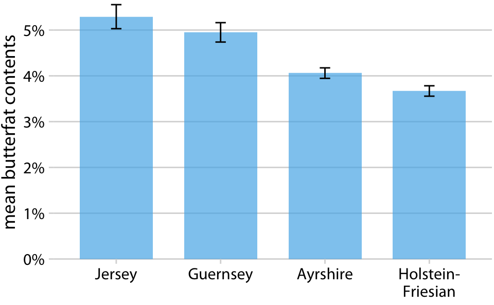
Milk butterfat contents by cattle breed. Source: Canadian Record of Performance for Purebred Dairy Cattle
We all know how to visualize uncertainty, right?
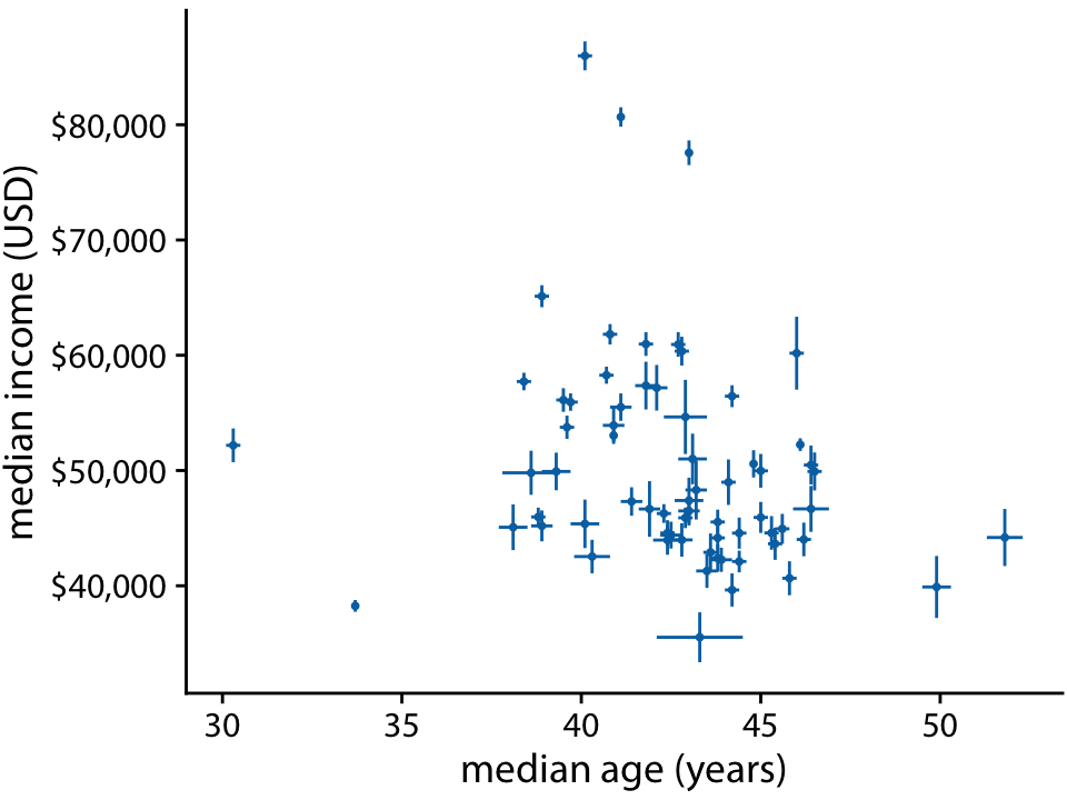
Income versus age for 67 counties in Pennsylvania. Source: 2015 Five-Year American Community Survey
We all know how to visualize uncertainty, right?
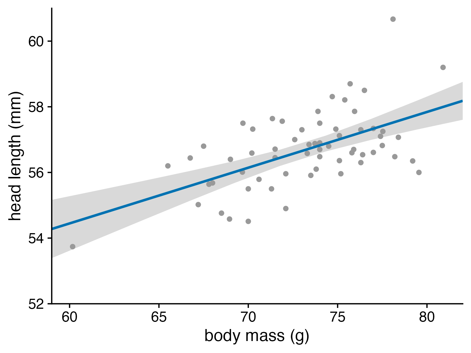
Head length versus body mass for male blue jays. Data source: Keith Tarvin, Oberlin College
It’s often not clear what the visualizations represent
In particular, error bars can represent many different quantities
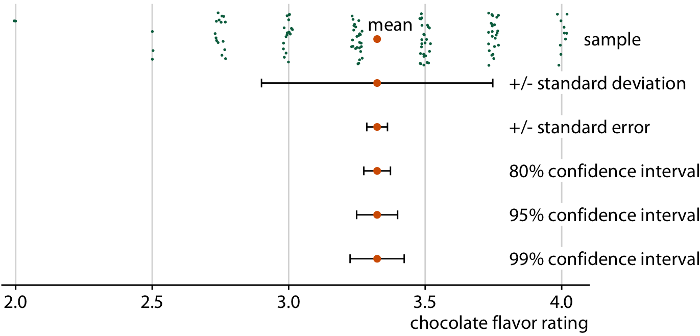
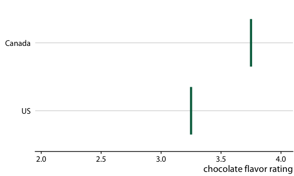
Chocolate bar ratings. Source: Manhattan Chocolate Society
Uncertainty shown as 95% CI error bars with caps
Chocolate bars from four countries compared to bars from the US
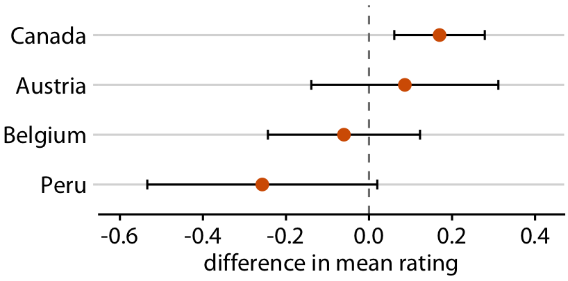
Relative rankings compared to US chocolate bars. Source: Manhattan Chocolate Society
Uncertainty shown as 95% CI error bars with caps
Determinstic Construal Error:
Error bars are interpreted as min/max values
Relative rankings compared to US chocolate bars. Source: Manhattan Chocolate Society
Uncertainty shown as 95% CI error bars with caps
Categorical thinking:
Areas outside and inside the error bars are categorically different
Relative rankings compared to US chocolate bars. Source: Manhattan Chocolate Society
Uncertainty shown as 95% CI error bars without caps
You can remove caps to make the boundary visually less severe
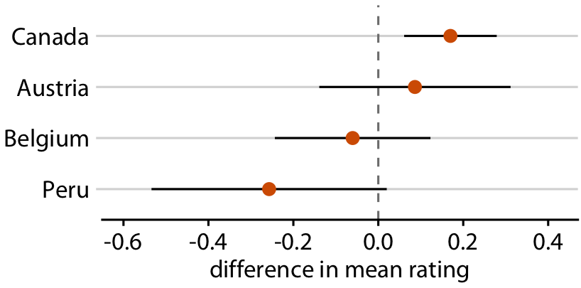
Relative rankings compared to US chocolate bars. Source: Manhattan Chocolate Society
Uncertainty shown as graded error bars
You can show multiple confidence levels to de-emphasize existence of boundary
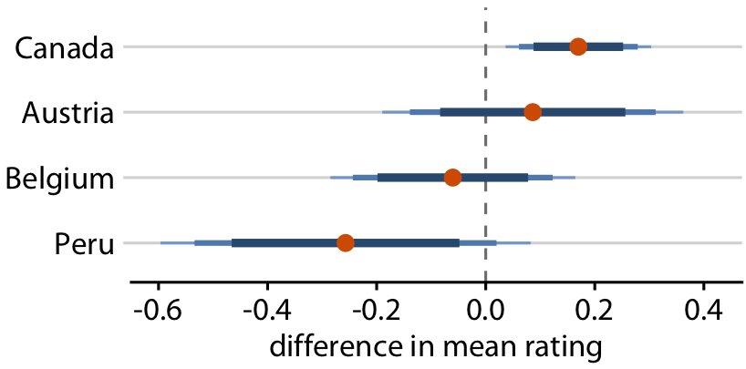
Relative rankings compared to US chocolate bars. Source: Manhattan Chocolate Society
Uncertainty shown as confidence strips
You can use faded strips (but hard to read/interpret)
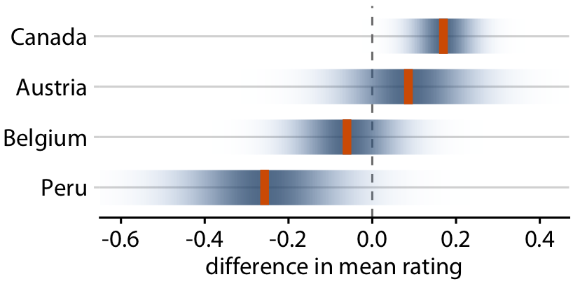
Relative rankings compared to US chocolate bars. Source: Manhattan Chocolate Society
Uncertainty shown as distributions
You can show actual distributions
Popular in Bayesian inference, but still difficult to interpret
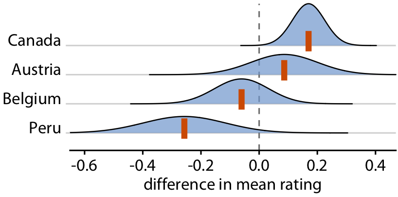
Relative rankings compared to US chocolate bars. Source: Manhattan Chocolate Society
Use frequency framing to communicate probabilities

Use frequency framing to communicate probabilities

Use frequency framing to communicate probabilities

Use frequency framing to communicate probabilities

Alternatively: Use Hypothetical Outcome Plots
Hypothetical Outcome Plots use animation to let viewers experience uncertainty
Let’s now consider the uncertainty of trend lines
What does the confidence band show?
Head length versus body mass for male blue jays. Data source: Keith Tarvin, Oberlin College
Let’s now consider the uncertainty of trend lines
Both the intercept and the slope have uncertainty
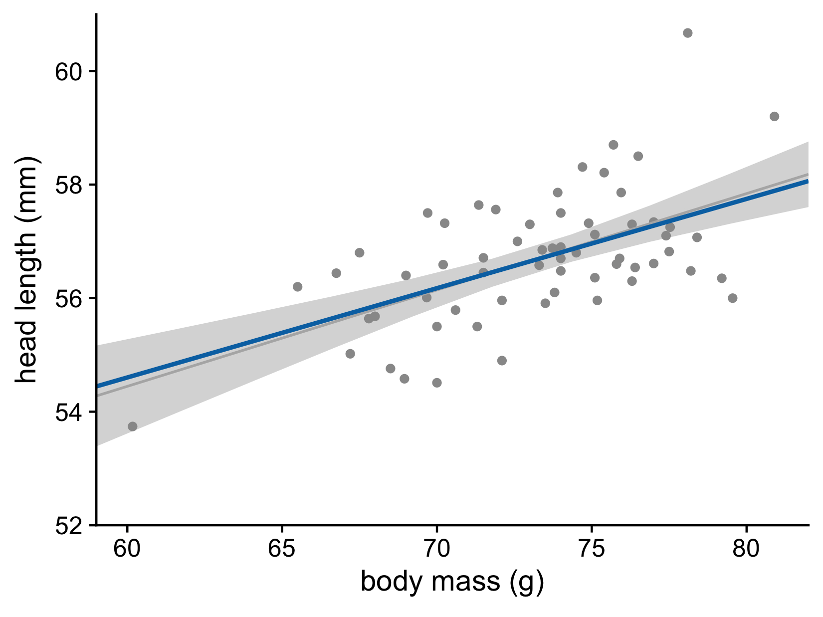
Head length versus body mass for male blue jays. Data source: Keith Tarvin, Oberlin College
It gets even more confusing for non-linear trend lines
Individual sample fits tend to be more wiggly than the mean
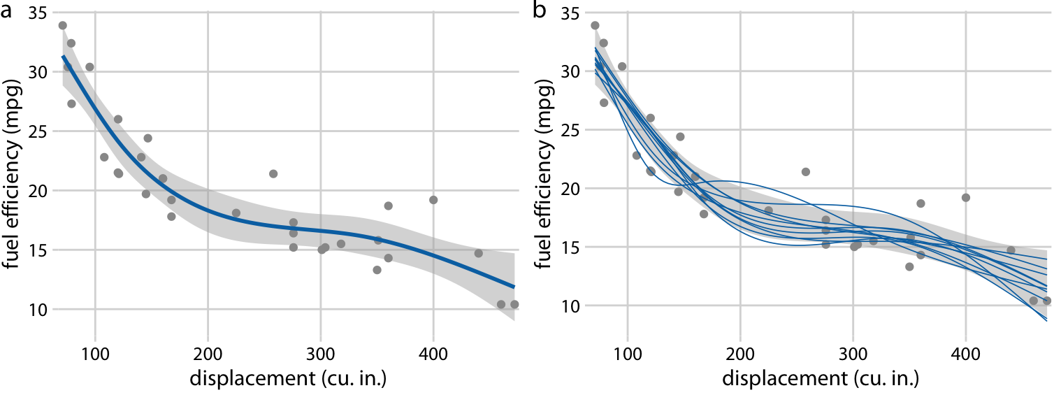
Fuel efficiency versus displacement, for 32 cars (1973–74 models). Source: Motor Trend, 1974
Hypothetical Outcome Plots again help develop intuition
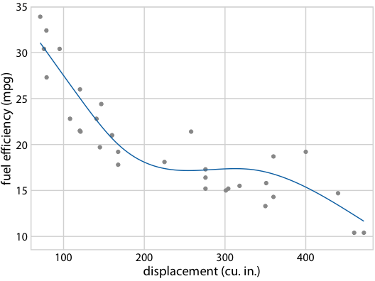
Fuel efficiency versus displacement, for 32 cars (1973–74 models). Source: Motor Trend, 1974
Making a plot with error bars
Example: Relationship between life expectancy and GDP per capita

Making a plot with error bars
Example: Relationship between life expectancy and GDP per capita


Making a plot with error bars

Half-eyes, gradient intervals, etc
The ggdist package provides many different visualizations of uncertainty

Half-eyes, gradient intervals, etc
The ggdist package provides many different visualizations of uncertainty
library(ggdist)
library(distributional) # for dist_normal()

lm_data |>
  filter(year == 1952) |>
  mutate(
    continent =
      fct_reorder(continent, estimate)
  ) |>
  ggplot(aes(x = estimate, y = continent)) +
  stat_dist_gradientinterval(
    aes(dist = dist_normal(
      mu = estimate, sigma = std.error
    )),
    point_size = 4,
    fill = "skyblue"
  )
Half-eyes, gradient intervals, etc
The ggdist package provides many different visualizations of uncertainty
library(ggdist)
library(distributional) # for dist_normal()

lm_data |>
  filter(year == 1952) |>
  mutate(
    continent =
      fct_reorder(continent, estimate)
  ) |>
  ggplot(aes(x = estimate, y = continent)) +
  stat_dist_dotsinterval(
    aes(dist = dist_normal(
      mu = estimate, sigma = std.error
    )),
    point_size = 4,
    fill = "skyblue",
    quantiles = 20
  )
Half-eyes, gradient intervals, etc
The ggdist package provides many different visualizations of uncertainty
library(ggdist)
library(distributional) # for dist_normal()

lm_data |>
  filter(year == 1952) |>
  mutate(
    continent =
      fct_reorder(continent, estimate)
  ) |>
  ggplot(aes(x = estimate, y = continent)) +
  stat_dist_dotsinterval(
    aes(dist = dist_normal(
      mu = estimate, sigma = std.error
    )),
    point_size = 4,
    fill = "skyblue",
    quantiles = 10
  )