# Run this command to install the required packages.
# You need to do this only once.
install.packages(
  c(
    "tidyverse", "palmerpenguins", "colorspace",
    "shiny", "shinyjs", "RCurl"
  )
)Effective Data Visualization with ggplot2
Working with colors
Required packages
Install the required packages:
1. CVD simulations and creating a categorical color palette
We will create a simple scatter plot using the default ggplot hue scale, test for suitability for people with color-vision deficiency (CVD), and then create our own color palette as a replacement.
library(tidyverse)
library(palmerpenguins) # for `penguins` data

p <- ggplot(penguins, aes(body_mass_g, bill_length_mm, color = species)) +
  geom_point() +
  scale_color_manual(
    # default ggplot2 scale_color_hue() colors
    values = c("#F8766D", "#619CFF", "#00BA38")
  ) +
  theme_bw()
p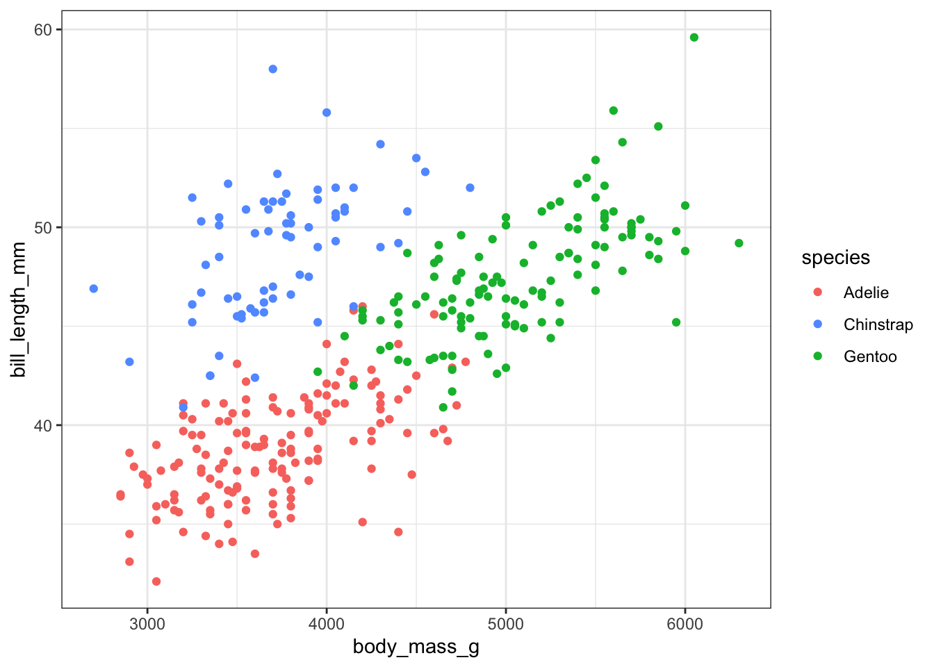
Now check the plot in the CVD simulator. You need to save it as an image file first.
# save the plot as png file
ggsave("penguins.png", p, width = 6, height = 4)

# and check it out in the cvd simulator
colorspace::cvd_emulator()
Now create your own categorical color palette using the color chooser app from the colorspace package.
# run interactively to choose colors
colorspace::choose_color()

# modify the plot
p <- ggplot(penguins, aes(body_mass_g, bill_length_mm, color = species)) +
  geom_point() +
  scale_color_manual(
    # your own colors here
    values = ...
  ) +
  theme_bw()
p

# save the plot as png file
ggsave("penguins.png", p, width = 6, height = 4)

# and check it out in the cvd simulator
colorspace::cvd_emulator()
2. Creating a sequential color palette
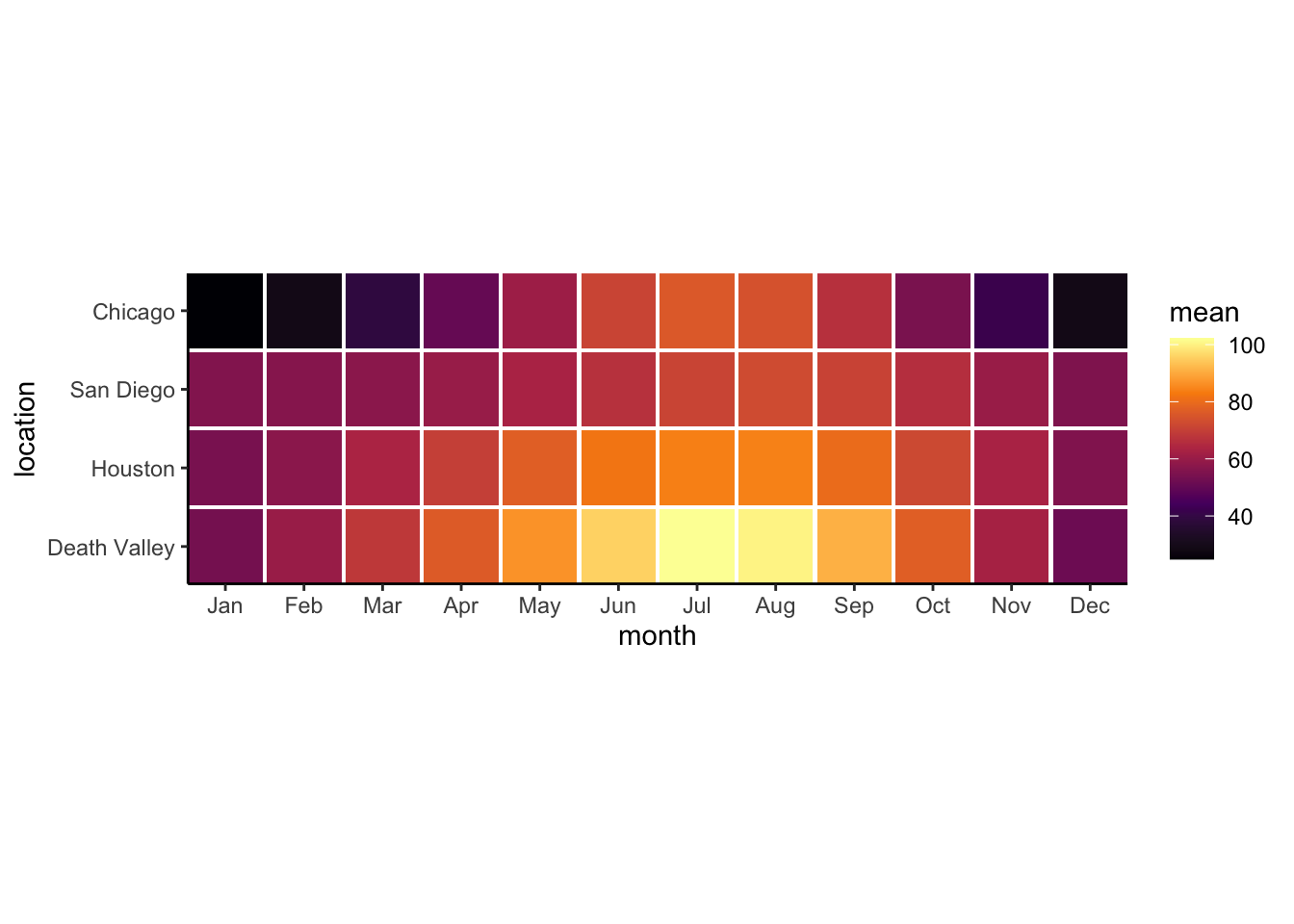
Now we will create a sequential color palette. We will use the following plot, which shows mean temperatures in four locales in the US.
# load and prepare data
temps_months <- read_csv("https://wilkelab.org/dataviz_shortcourse/datasets/tempnormals.csv") %>%
  group_by(location, month_name) %>%
  summarize(mean = mean(temperature)) %>%
  mutate(
    month = factor(
      month_name,
      levels = c("Jan", "Feb", "Mar", "Apr", "May", "Jun",
                 "Jul", "Aug", "Sep", "Oct", "Nov", "Dec")
    ),
    location = factor(
      location, levels = c("Death Valley", "Houston", "San Diego", "Chicago")
    )
  ) %>%
  select(-month_name)

# and plot
ggplot(temps_months, aes(x = month, y = location, fill = mean)) +
  geom_tile(width = 0.95, height = 0.95) +
  coord_fixed(expand = FALSE) +
  theme_classic() +
  scale_fill_gradientn(
    # this is the inferno scale, made with viridis::inferno(5)
    colours = c("#000004FF", "#56106EFF", "#BB3754FF", "#F98C0AFF", "#FCFFA4FF")
  )
Now create your own sequential color palette using the color chooser app from the colorspace package.
# run interactively to choose colors
colorspace::choose_color()

# modify the plot
ggplot(temps_months, aes(x = month, y = location, fill = mean)) +
  geom_tile(width = 0.95, height = 0.95) +
  coord_fixed(expand = FALSE) +
  theme_classic() +
  scale_fill_gradientn(
    # your own colors here
    colours = ...
  )