library(tidyverse)
library(colorspace)
library(cowplot)Effective Data Visualization with ggplot2
Sprucing up your legends, solutions to exercises
Load required packages
Solutions, Section 1
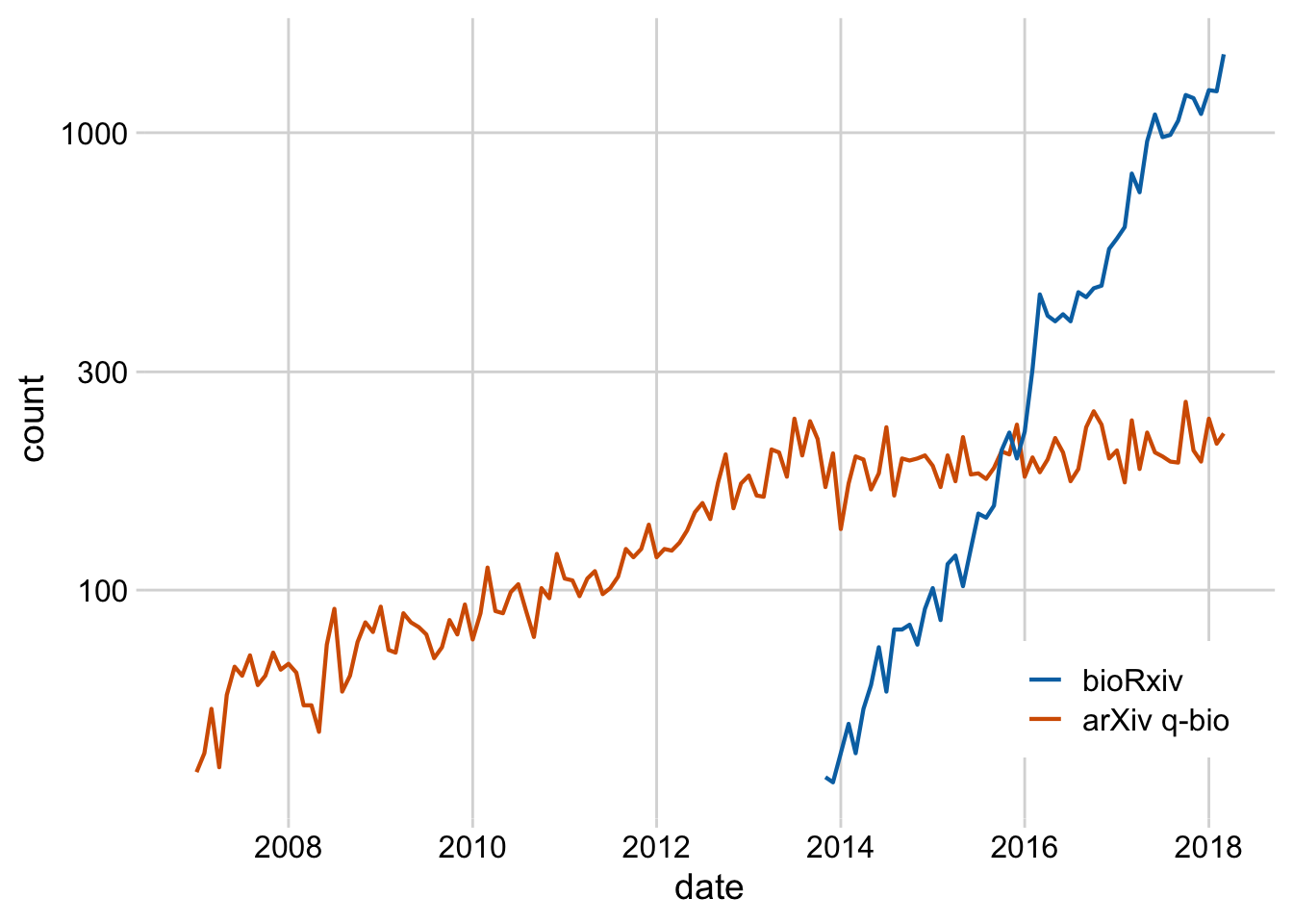
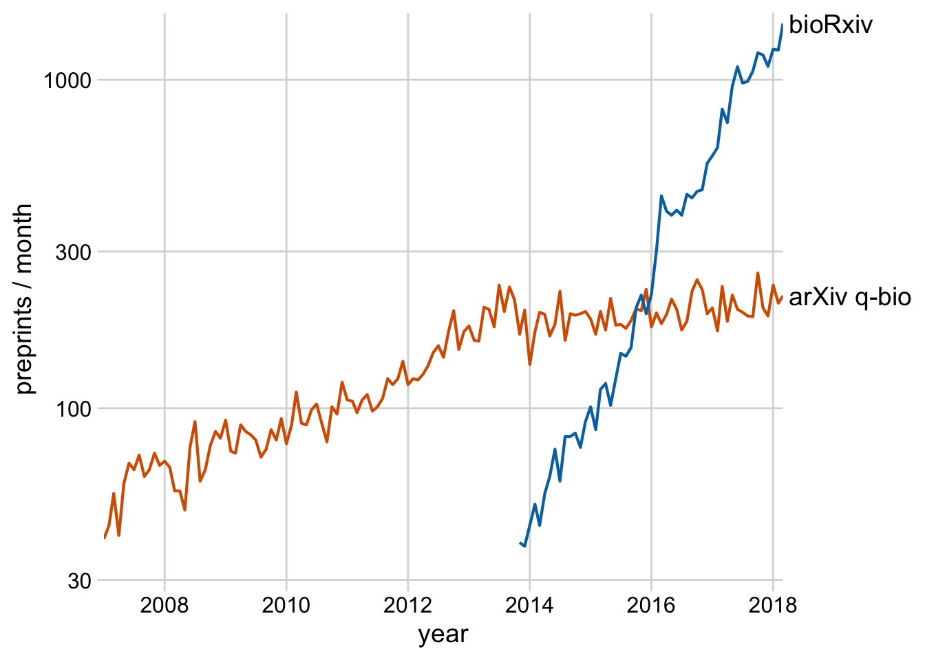
Exercise 1.1: Replace the legend in this plot with a secondary axis. Also style the plot.
preprints <- read_csv("https://wilkelab.org/dataviz_shortcourse/datasets/preprints.csv") |>
  filter(archive %in% c("bioRxiv", "arXiv q-bio")) |>
  filter(count > 0)

ggplot(preprints) +
  aes(date, count, color = archive) +
  geom_line(linewidth = 0.75) +
  scale_y_log10() +
  scale_x_date() +
  scale_color_manual(values = c("#D55E00", "#0072B2"))
preprints_final <- filter(preprints, date == max(date))

ggplot(preprints) +
  aes(date, count, color = archive) +
  geom_line(linewidth = 0.75) +
  scale_y_log10(
    limits = c(29, 1600),
    breaks = c(30, 100, 300, 1000),
    expand = c(0, 0),
    name = "preprints / month",
    sec.axis = dup_axis(
      breaks = preprints_final$count,
      labels = preprints_final$archive,
      name = NULL
    )
  ) +
  scale_x_date(name = "year", expand = c(0, 0)) +
  scale_color_manual(values = c("#D55E00", "#0072B2"), guide = "none") +
  theme_minimal_grid() +
  theme(
    axis.ticks.y.right = element_blank(),
    axis.text.y.right = element_text(
      size = 14,
      margin = margin(0, 0, 0, 0)
    )
  )
Exercise 1.2: Take the plot from Exercise 1.1 and label it with annotate() instead of using a secondary axis. Also color the text labels.
ggplot(preprints) +
  aes(date, count, color = archive) +
  geom_line(linewidth = 0.75) +
  scale_y_log10(
    limits = c(29, 1600),
    breaks = c(30, 100, 300, 1000),
    expand = c(0, 0),
    name = "preprints / month"
  ) +
  scale_x_date(name = "year", expand = c(0, 0)) +
  scale_color_manual(values = c("#D55E00", "#0072B2"), guide = "none") +
  annotate(
    geom = "text",
    label = c("arXiv q-bio", "bioRxiv"),
    x = ymd(c("2012-05-01", "2016-12-01")),
    y = c(180, 700),
    hjust = c(1, 1),
    color = colorspace::darken(c("#D55E00", "#0072B2"), .3),
    size = 14,
    size.unit = "pt"
  ) +
  theme_minimal_grid()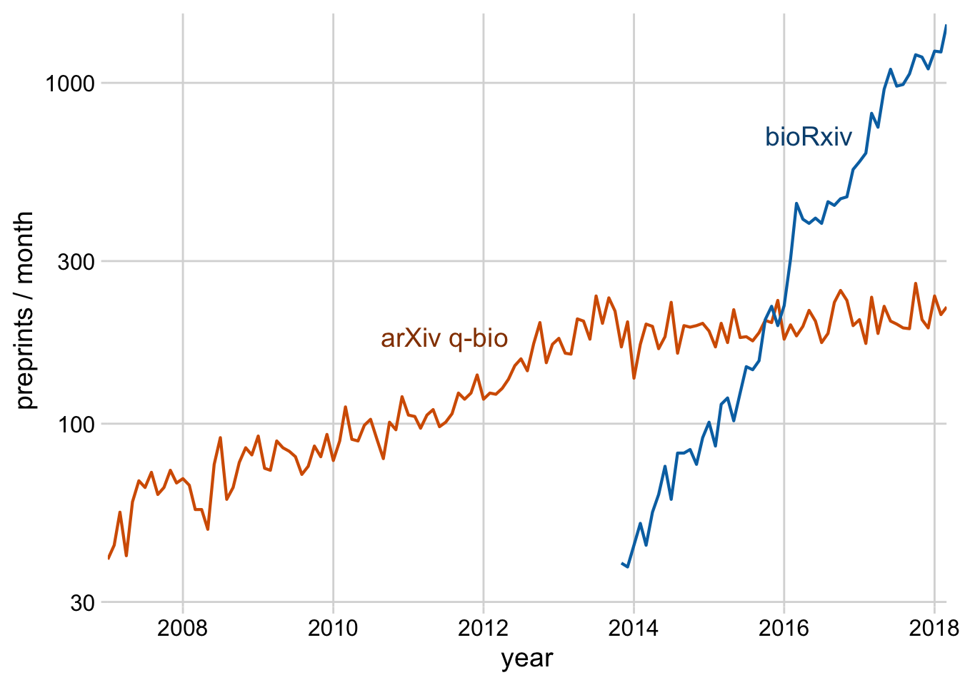
Exercise 1.3: Style this plot and place the legend in the correct order.
library(palmerpenguins)

penguins |>
  na.omit() |>
  ggplot() +
  aes(body_mass_g, sex, fill = species) +
  geom_boxplot(position = "dodge")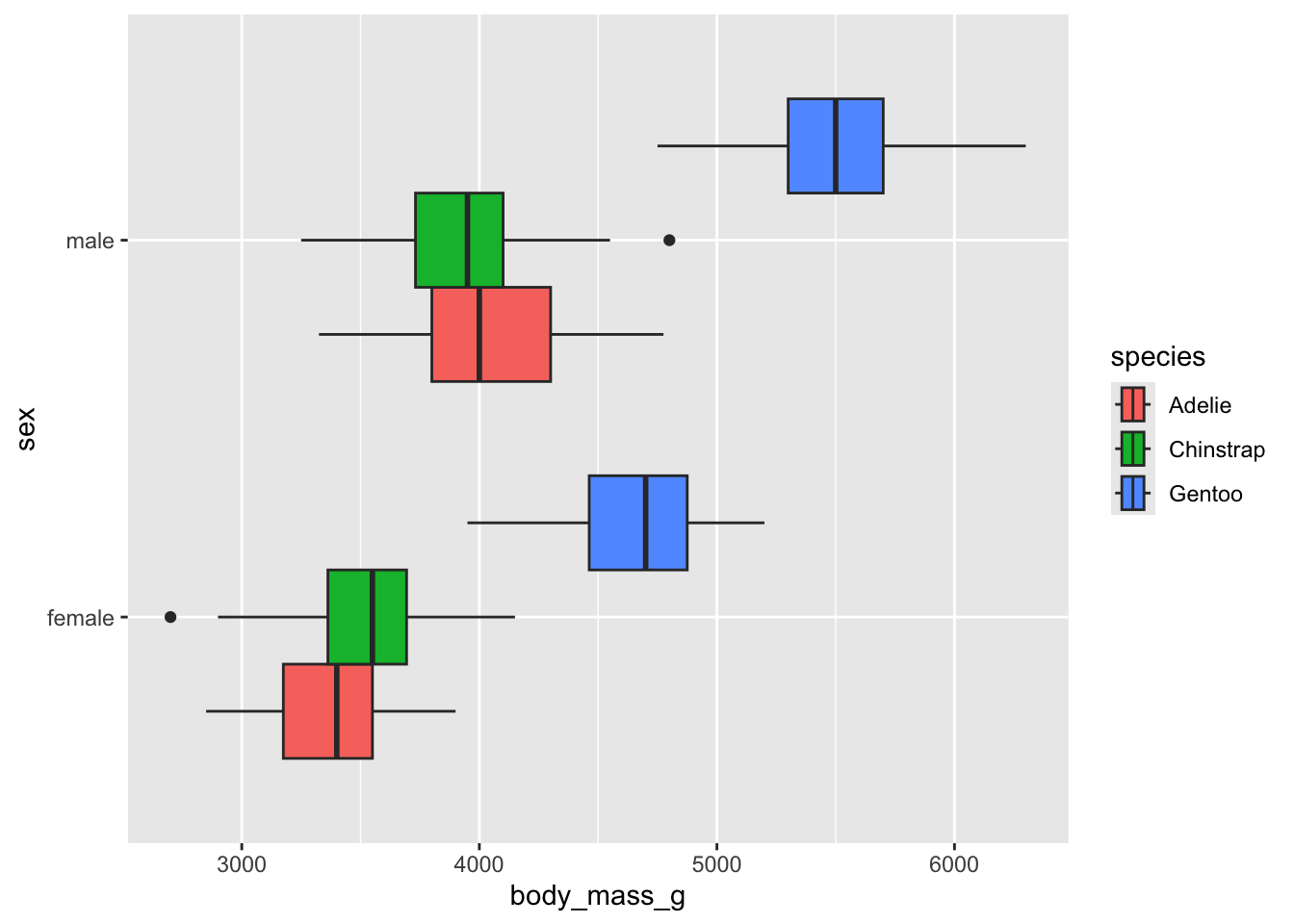
p <- penguins |>
  na.omit() |>
  ggplot() +
  aes(body_mass_g, sex, fill = species) +
  geom_boxplot(position = "dodge") +
  scale_fill_manual(
    values = c("#E69F00", "#56B4E9", "#009E73"),
    name = NULL,
    # when categorical variables are placed along the y axis, the legend
    # generally has to be reversed
    guide = guide_legend(reverse = TRUE)
  ) +
  theme_minimal_vgrid() +
  panel_border() +
  theme(
    legend.key.width = grid::unit(32, "pt")
  )

p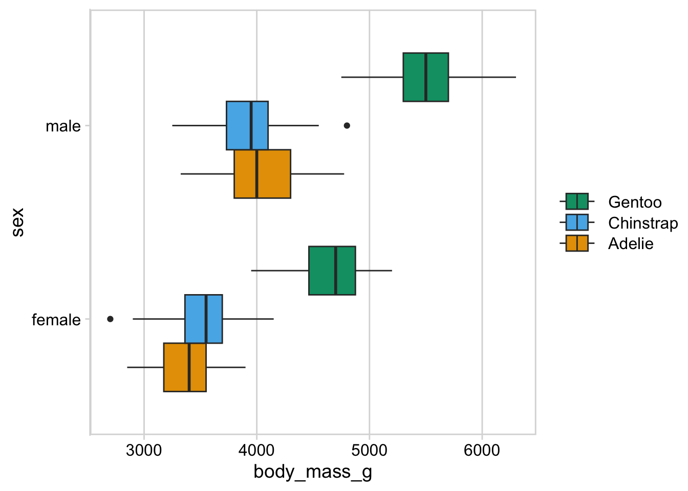
For this plot, a legend along the top of the plot looks better to me. You still want the ordering to match though (left-to-right should match top-to-bottom).
p + theme(legend.position = "top")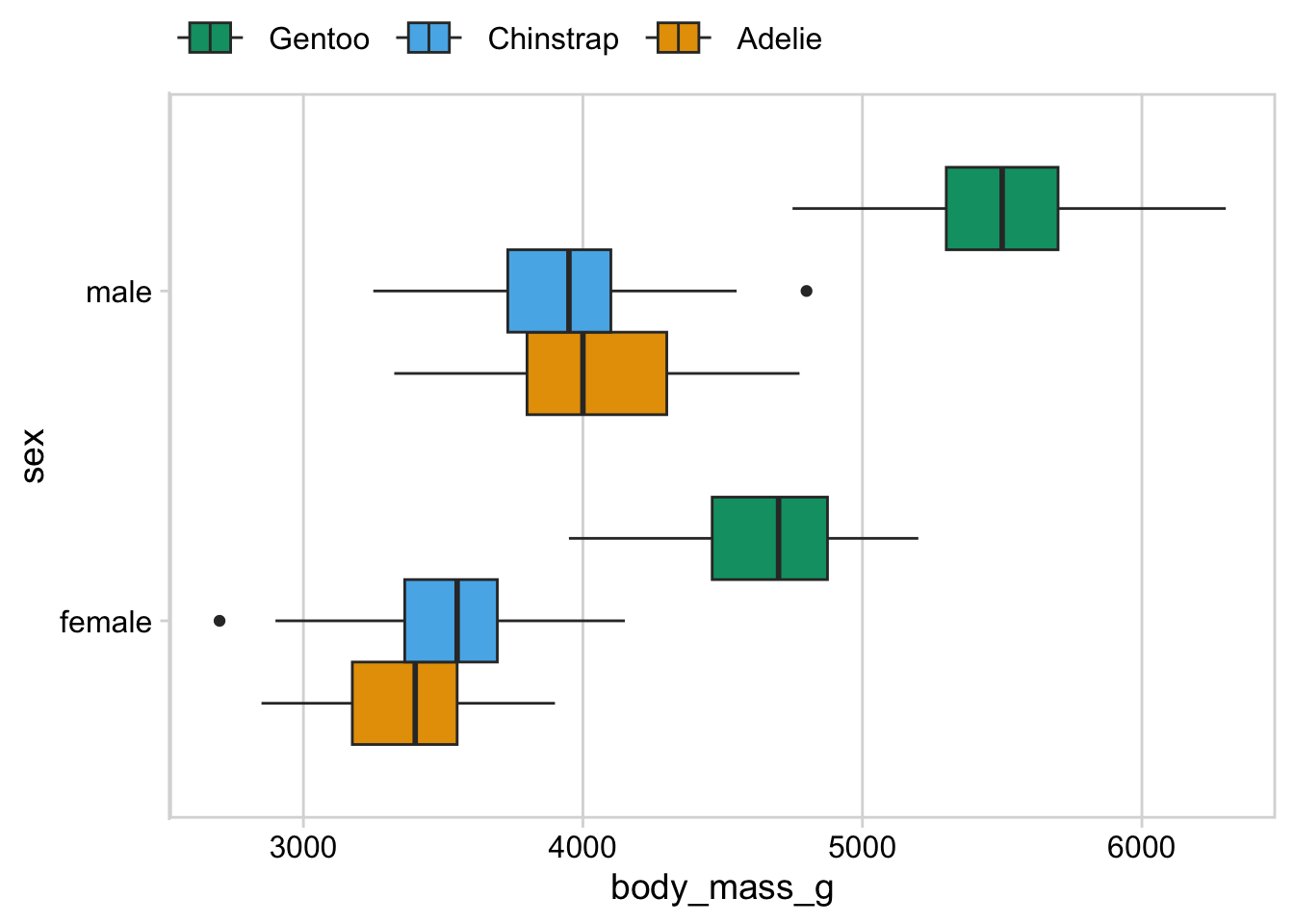
Solutions, Section 2
Exercise 2.1: Take the preprint plot from a prior exercise and move the legend inside the plot.
preprints <- read_csv("https://wilkelab.org/dataviz_shortcourse/datasets/preprints.csv") |>
  filter(archive %in% c("bioRxiv", "arXiv q-bio")) |>
  filter(count > 0)

ggplot(preprints) +
  aes(date, count, color = archive) +
  geom_line(linewidth = 0.75) +
  scale_y_log10() +
  scale_x_date() +
  scale_color_manual(values = c("#D55E00", "#0072B2"))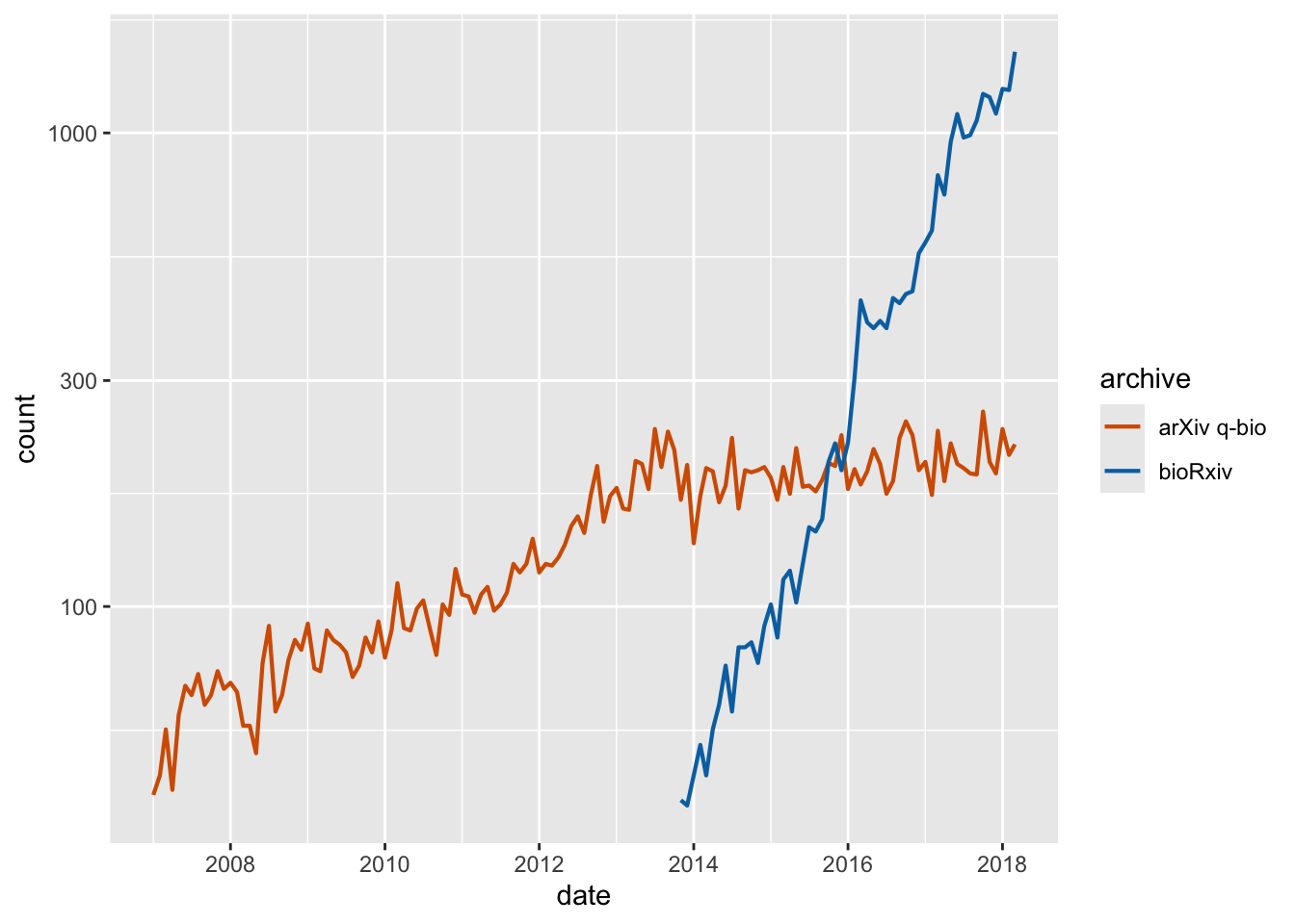
ggplot(preprints) +
  aes(date, count, color = archive) +
  geom_line(linewidth = 0.75) +
  scale_y_log10() +
  scale_x_date() +
  scale_color_manual(
    name = NULL,
    values = c("#D55E00", "#0072B2"),
    guide = guide_legend(reverse = TRUE)
  ) +
  theme_minimal_grid() +
  theme(
    legend.position = "inside",
    legend.position.inside = c(0.96, 0.1),
    legend.justification = c(1, 0),
    legend.box.background = element_rect(fill = "white", color = "white"),
    legend.box.margin = margin(7, 7, 7, 7)
  )