# Run this command to install the required packages.
# You need to do this only once.
install.packages(
  c(
    "tidyverse", "colorspace", "cowplot",
    "palmerpenguins"
  )
)Effective Data Visualization with ggplot2
Sprucing up your legends
Required packages
Install the required packages:
1. Legend order and direct labeling
By default, ggplot places legend entries in alphabetical order, and that is rarely what we want. See this example:
library(tidyverse)
library(colorspace)
library(cowplot)     # for theme functions

tech_stocks <- read_csv("https://wilkelab.org/dataviz_shortcourse/datasets/tech_stocks.csv") |>
  mutate(date = ymd(date)) |>
  select(company, date, price_indexed)

ggplot(tech_stocks) +
  aes(x = date, y = price_indexed) +
  geom_line(aes(color = company), na.rm = TRUE) +
  scale_x_date(
    limits = ymd(c("2012-06-01", "2017-05-31")),
    expand = c(0, 0)
  ) +
  scale_y_continuous(
    limits = c(0, 560),
    expand = c(0, 0)
  )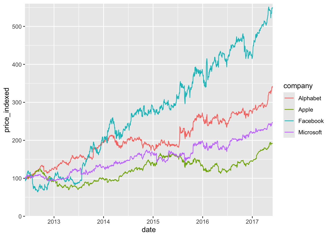
The visual order of the lines is Facebook, Alphabet, Microsoft, Apple, and we should match it by reodering the categorical variable.
tech_stocks |>
  mutate(
    company = fct_relevel(
      company,
      "Facebook",  "Alphabet", "Microsoft", "Apple"
    )
  ) |>
  ggplot() +
  aes(x = date, y = price_indexed) +
  geom_line(aes(color = company), na.rm = TRUE) +
  scale_x_date(
    limits = ymd(c("2012-06-01", "2017-05-31")),
    expand = c(0, 0)
  ) +
  scale_y_continuous(
    limits = c(0, 560),
    expand = c(0, 0)
  )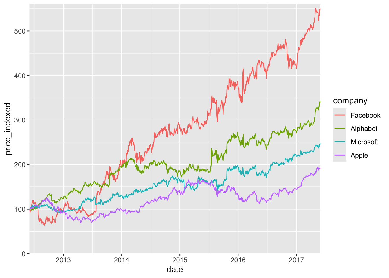
This is improved, but we can do better. We can get rid of the legend entirely, by adding a secondary axis. I call this the secondary axis trick.
tech_stocks_last <- tech_stocks |>
  filter(date == max(date))

ggplot(tech_stocks) +
  aes(x = date, y = price_indexed) +
  geom_line(aes(color = company), na.rm = TRUE) +
  scale_x_date(
    limits = ymd(c("2012-06-01", "2017-05-31")),
    expand = c(0, 0)
  ) +
  scale_y_continuous(
    limits = c(0, 560),
    expand = c(0, 0),
    sec.axis = dup_axis(
      breaks = tech_stocks_last$price_indexed,
      labels = tech_stocks_last$company,
      name = NULL
    )
  ) +
  guides(color = "none")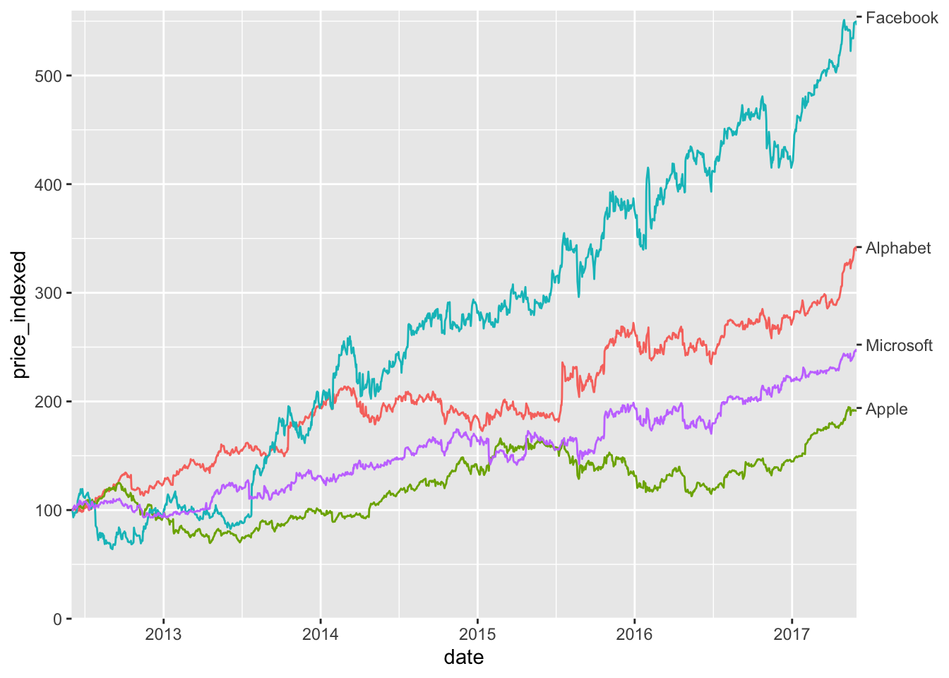
The secondary axis trick works well when we are dealing with time series but it doesn’t work in cases where we need labels in the middle of the plot. In those cases, we can use the annotate() function to add labels in specific locations of the plot.
Consider this simple scatter plot:
ggplot(iris) +
  aes(Sepal.Length, Sepal.Width, color = Species) +
  geom_point(aes(shape = Species))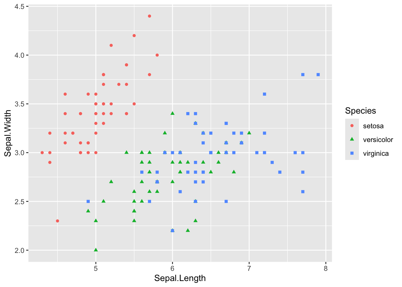
We can eliminate the legend by labeling it as follows:
ggplot(iris) +
  aes(Sepal.Length, Sepal.Width, color = Species) +
  geom_point(aes(shape = Species)) +
  guides(color = "none", shape = "none") + # turn off legend
  annotate( # add manual text annotation
    geom = "text",
    label = c("I. setosa", "I. versicolor", "I. virginica"),
    # locations chosen manually
    x  = c(5.7, 5.1, 7.6),
    y = c(4.2, 2.02, 3.78),
    hjust = c(0, 0, 1),
    size = 12,
    size.unit = "pt",
  )
We may want to color the text similar to the points. To do this, we need to keep in mind that text generally needs darker colors because it consists of thin lines.
colors <- c(
  setosa = "#009E73",
  versicolor = "#E69F00",
  virginica = "#56B4E9"
)

ggplot(iris) +
  aes(Sepal.Length, Sepal.Width, color = Species) +
  geom_point(aes(shape = Species)) +
  guides(color = "none", shape = "none") + # turn off legend
  scale_color_manual(values = colors) +
  annotate( # add manual text annotation
    geom = "text",
    label = c("I. setosa", "I. versicolor", "I. virginica"),
    # locations chosen manually
    x  = c(5.7, 5.1, 7.6),
    y = c(4.2, 2.02, 3.78),
    hjust = c(0, 0, 1),
    color = colorspace::darken(colors, .25),
    size = 12,
    size.unit = "pt"
  ) +
  theme_minimal_grid(12)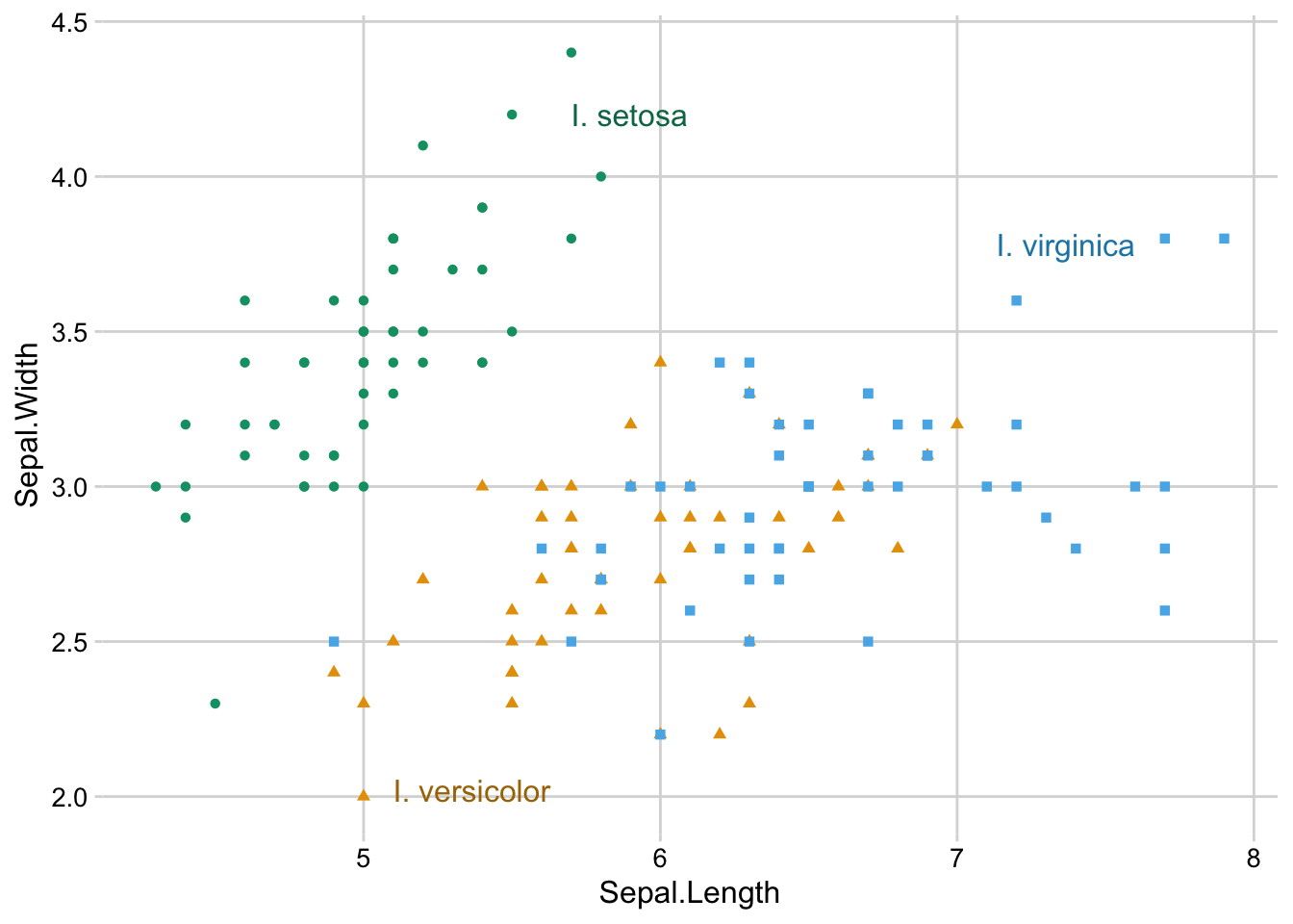
Exercises
Exercise 1.1: Replace the legend in this plot with a secondary axis. Also style the plot.
preprints <- read_csv("https://wilkelab.org/dataviz_shortcourse/datasets/preprints.csv") |>
  filter(archive %in% c("bioRxiv", "arXiv q-bio")) |>
  filter(count > 0)

ggplot(preprints) +
  aes(date, count, color = archive) +
  geom_line(linewidth = 0.75) +
  scale_y_log10() +
  scale_x_date() +
  scale_color_manual(values = c("#D55E00", "#0072B2"))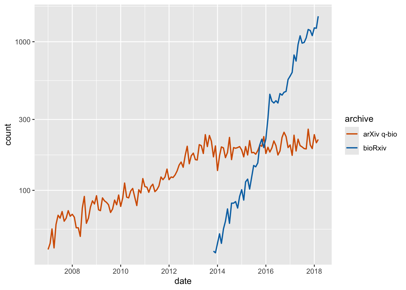
Exercise 1.2: Take the plot from Exercise 1.1 and label it with annotate() instead of using a secondary axis. Also color the text labels.
Exercise 1.3: Style this plot and place the legend in the correct order.
library(palmerpenguins)

penguins |>
  na.omit() |>
  ggplot() +
  aes(body_mass_g, sex, fill = species) +
  geom_boxplot(position = "dodge")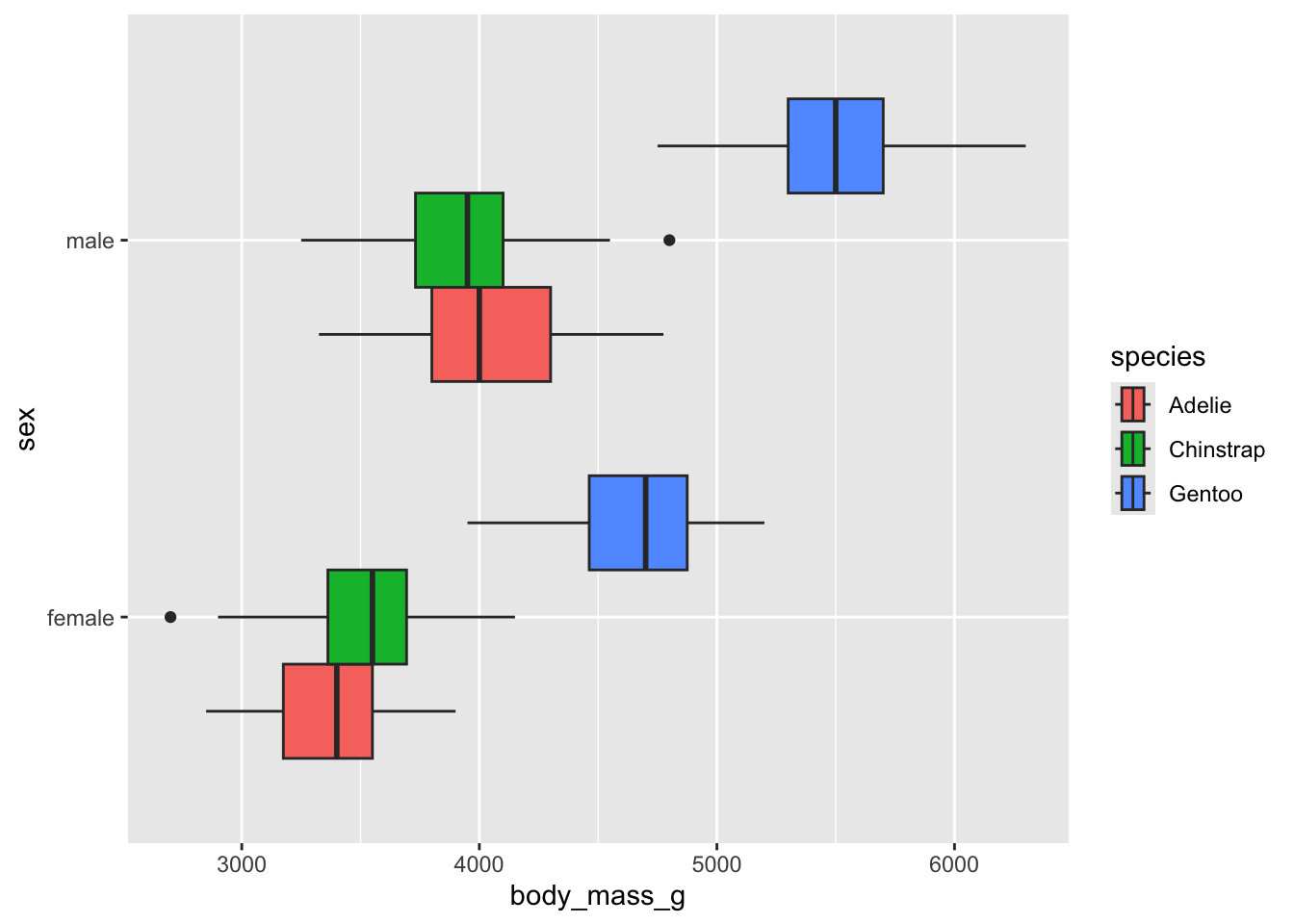
2. Legend placement and styling
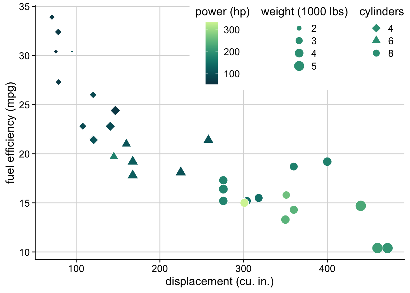
The legend layout code has been completely rewritten in ggplot2 3.5, and is now much more powerful. The following plot from my dataviz book required extensive tricks when I made it in 2019, and now it is possible with the standard options that are available out of the box.
ggplot(mtcars) +
  aes(disp, mpg, fill = hp, shape = factor(cyl), size = wt) +
  geom_point(color = "white") +
  scale_shape_manual(
    values = c(23, 24, 21),
    name = "cylinders"
  ) +
  scale_fill_continuous_sequential(
    palette = "Emrld",
    name = "power (hp)",
    breaks = c(100, 200, 300),
    rev = FALSE
  ) +
  xlab("displacement (cu. in.)") +
  ylab("fuel efficiency (mpg)") +
  guides(
    fill = guide_colorbar(order = 1),
    size = guide_legend(
      override.aes = list(shape = 21, fill = "#329D84"),
      title = "weight (1000 lbs)",
      order = 2
    ),
    shape = guide_legend(
      override.aes = list(size = 4, fill = "#329D84"),
      order = 3
    )
  ) +
  theme_half_open() +
  background_grid() +
  theme(
    # lay out the legends inside the legend box horizontally
    legend.box = "horizontal",
    # lay out each individual legend vertically
    legend.direction = "vertical",
    # place the legend box inside the plot
    legend.position = "inside",
    # place the anchor point for the legend box in the top right corner
    legend.justification = c(1, 1),
    # position the legend in the top right corner
    legend.position.inside = c(1, 1),
    # center the legend titles on top of the legends
    legend.title = element_text(hjust = 0.5),
    # add some margin to the legend box
    legend.box.margin = margin(7, 7, 7, 7),
    # add a white background to the legend box to cover the plot grid
    legend.box.background = element_rect(fill = "white", color = "white")
  )
Exercises
Exercise 2.1: Take the preprint plot from a prior exercise and move the legend inside the plot.
preprints <- read_csv("https://wilkelab.org/dataviz_shortcourse/datasets/preprints.csv") |>
  filter(archive %in% c("bioRxiv", "arXiv q-bio")) |>
  filter(count > 0)

ggplot(preprints) +
  aes(date, count, color = archive) +
  geom_line(linewidth = 0.75) +
  scale_y_log10() +
  scale_x_date() +
  scale_color_manual(values = c("#D55E00", "#0072B2"))