library(tidyverse)
library(cowplot)

ggplot(economics) +
  aes(date, psavert) +
  geom_line() +
  scale_x_continuous(
    expand = c(0, 0)
  ) +
  theme_minimal_hgrid()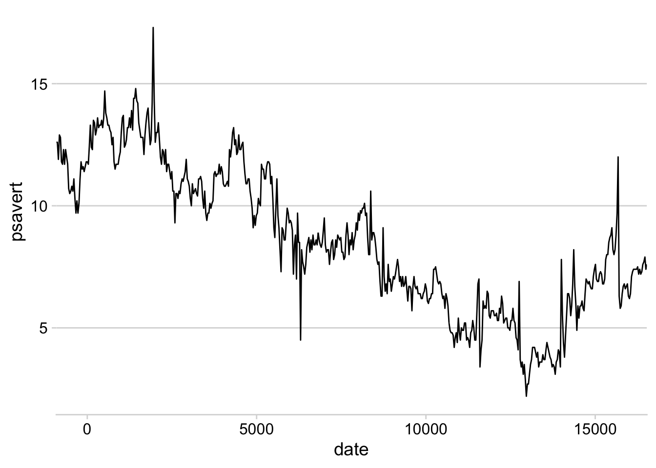
Plot design with themes and axes, solutions to exercises
Add appropriate themes and axis expansions to the following plots.
Exercise 1.1:
library(tidyverse)
library(cowplot)
ggplot(economics) +
aes(date, psavert) +
geom_line() +
scale_x_continuous(
expand = c(0, 0)
) +
theme_minimal_hgrid()
Exercise 1.2:
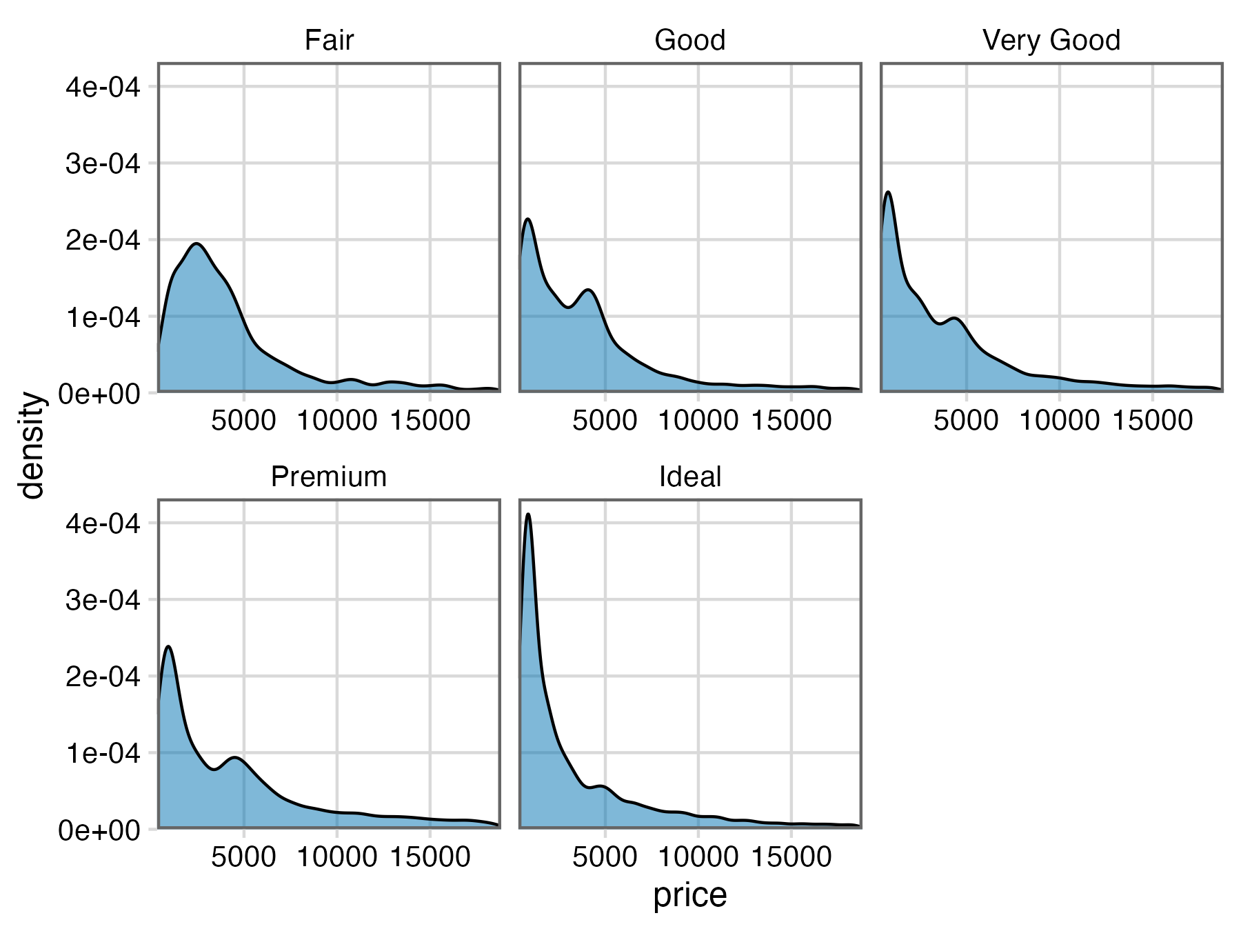
ggplot(diamonds, aes(price)) +
  geom_density(fill = "#0072B280") +
  facet_wrap(~cut) +
  theme_minimal_grid(12) +
  scale_x_continuous(
    expand = c(0, 0)
  ) +
  scale_y_continuous(
    expand = expansion(mult = c(0, 0.05))
  ) +
  panel_border("gray40")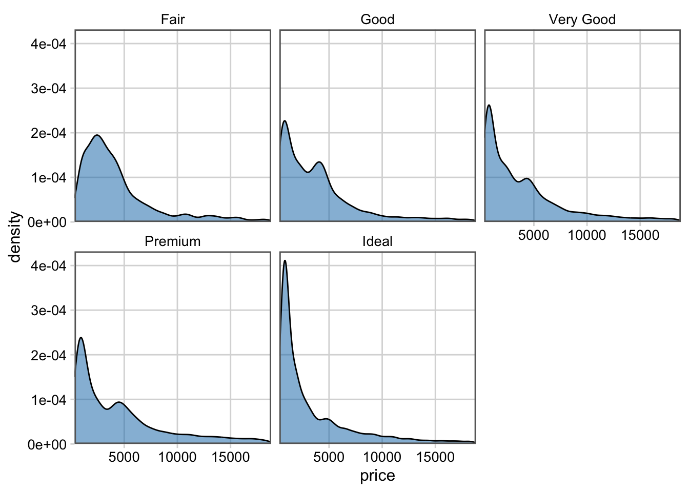
Exercise 1.3:
library(gapminder)

gapminder |>
  filter(
    year == 2007,
    continent == "Americas"
  ) |>
  mutate(
    country = fct_reorder(country, lifeExp)
  ) |>
  ggplot(aes(lifeExp, country)) +
  geom_point() +
  scale_y_discrete(name = NULL) +
  theme_minimal_grid(12, rel_small = 1)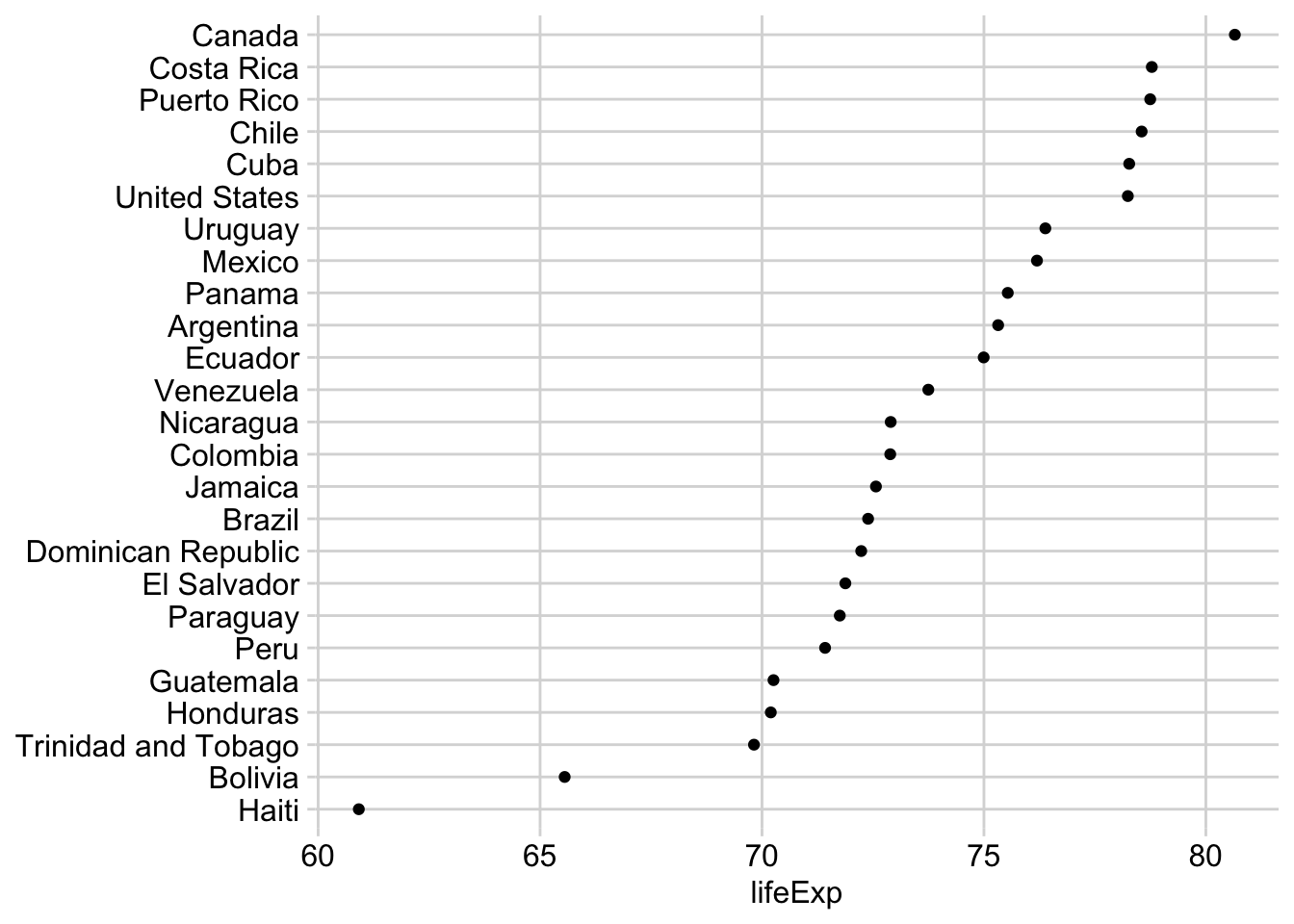
Exercise 1.4:
ggplot(mtcars) +
  aes(hp, mpg) +
  geom_point() +
  theme_half_open() +
  background_grid()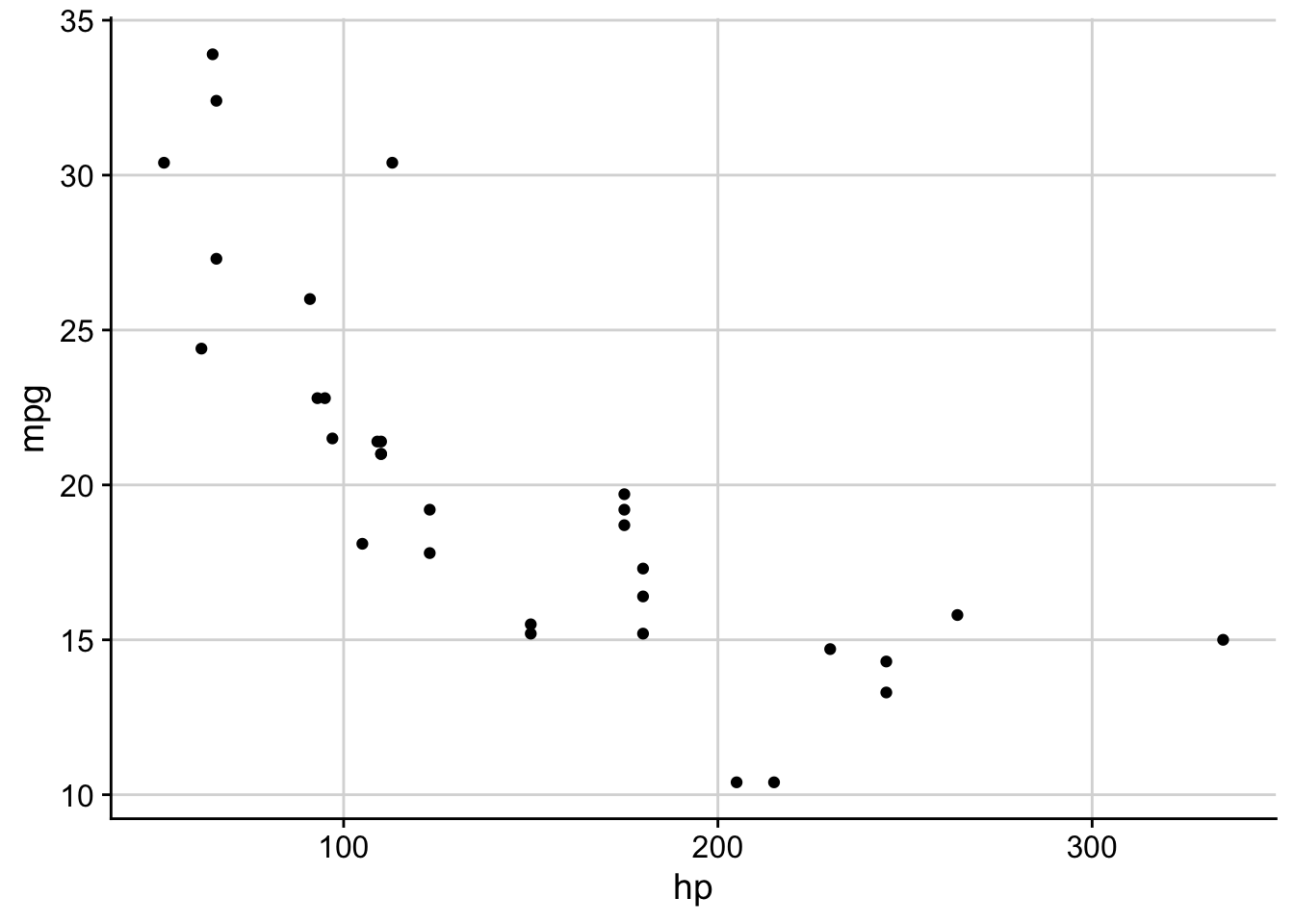
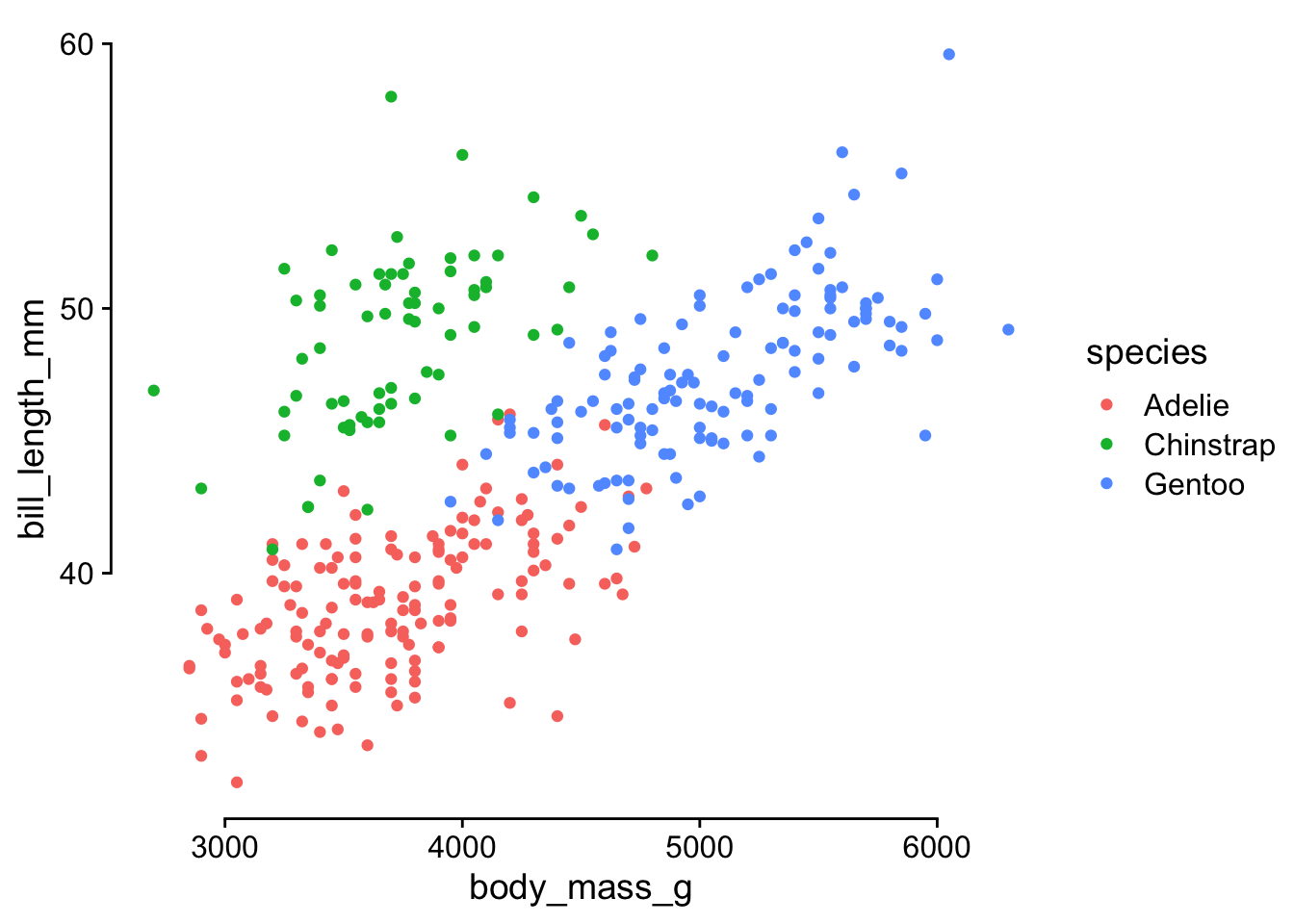
Exercise 2.1: Convert this plot to base-R style with capped axes.
library(palmerpenguins)

ggplot(penguins) +
  aes(body_mass_g, bill_length_mm, color = species) +
  geom_point(na.rm = TRUE) +
  theme_half_open() +
  guides(
    x = guide_axis(cap = "both"),
    y = guide_axis(cap = "both")
  )
Exercise 2.2: In a previous exercise you styled this plot. See if you can improve your design with the new axis options for faceted plots.
ggplot(diamonds, aes(price)) +
  geom_density(fill = "#0072B280") +
  facet_wrap(
    ~cut,
    axes = "all_x"
  ) +
  theme_minimal_grid(12) +
  scale_x_continuous(
    expand = c(0, 0)
  ) +
  scale_y_continuous(
    expand = expansion(mult = c(0, 0.05))
  ) +
  panel_border("gray40")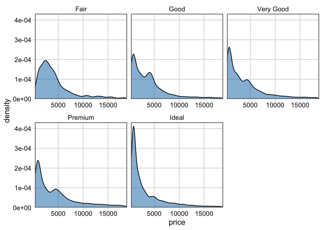
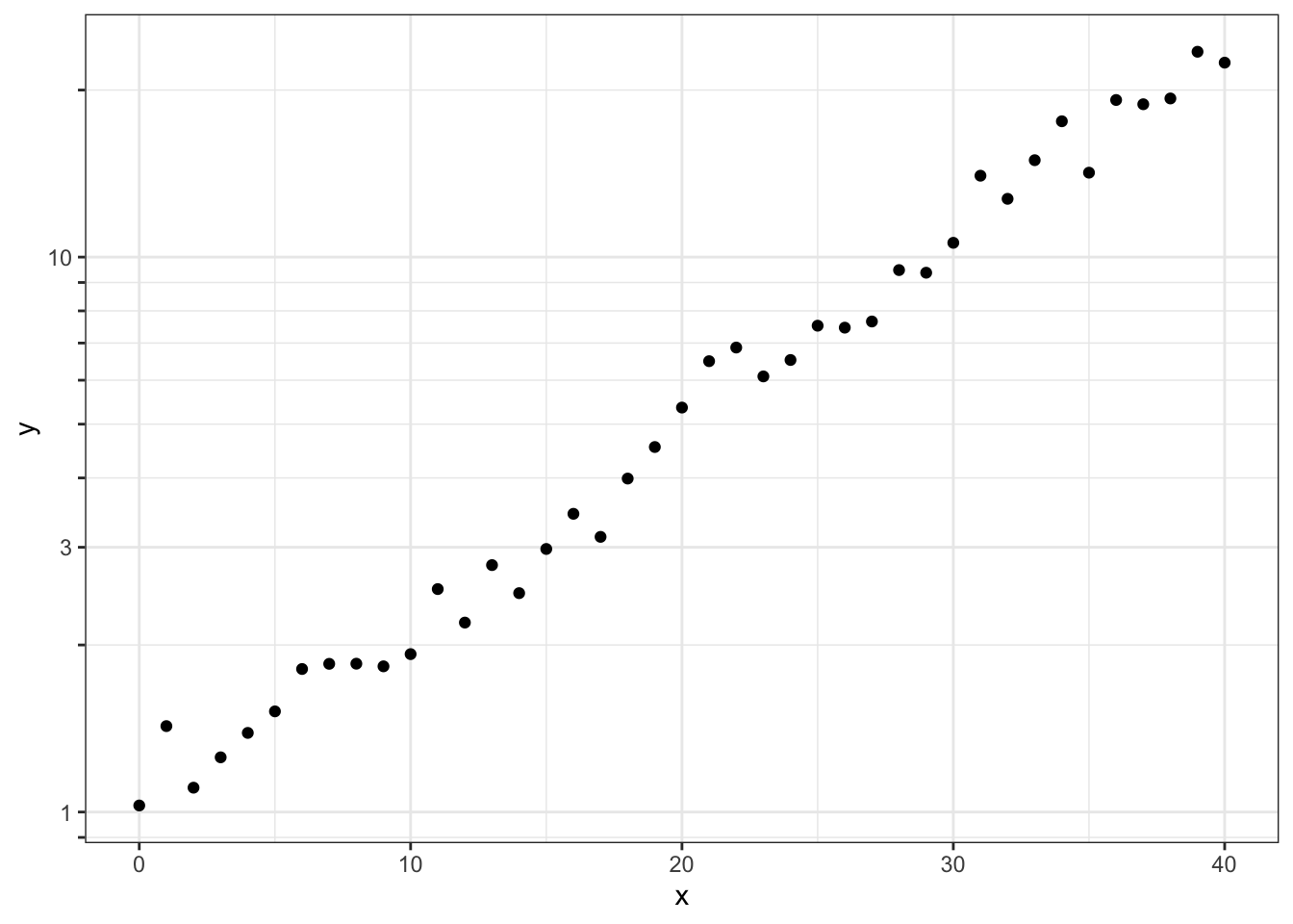
Exercise 2.3: Adjust the minor grid lines in this plot to match the log ticks.
# made-up data that follows exponential growth
exp_data <- tibble(x = 0:40) |>
  mutate(
    y = exp(0.08 * x + 0.1 * rnorm(length(x)))
  )

ggplot(exp_data, aes(x, y)) +
  geom_point() +
  theme_bw() +
  scale_y_log10(
    # sometimes the simplest solution
    # is a quick manual fix
    minor_breaks = c(
      .8, .9, 2, 4, 5, 6, 7, 8, 9, 20
    ),
    guide = guide_axis_logticks(
      # make major and minor ticks all the same length
      long = 1,
      mid = 1,
      short = 1
    )
  )
Exercise 3.1: Take your styled plot from Exercise 1.3 and save it as an image with ggsave().
p <- gapminder |>
  filter(
    year == 2007,
    continent == "Americas"
  ) |>
  mutate(
    country = fct_reorder(country, lifeExp)
  ) |>
  ggplot(aes(lifeExp, country)) +
  geom_point(size = 2.5) + # need bigger points for balanced look
  scale_y_discrete(name = NULL) +
  theme_minimal_grid(12, rel_small = 1)

ggsave("plot_exercise3.1.png", p, width = 6, height = 6, bg = "white")
magick::image_read("plot_exercise3.1.png")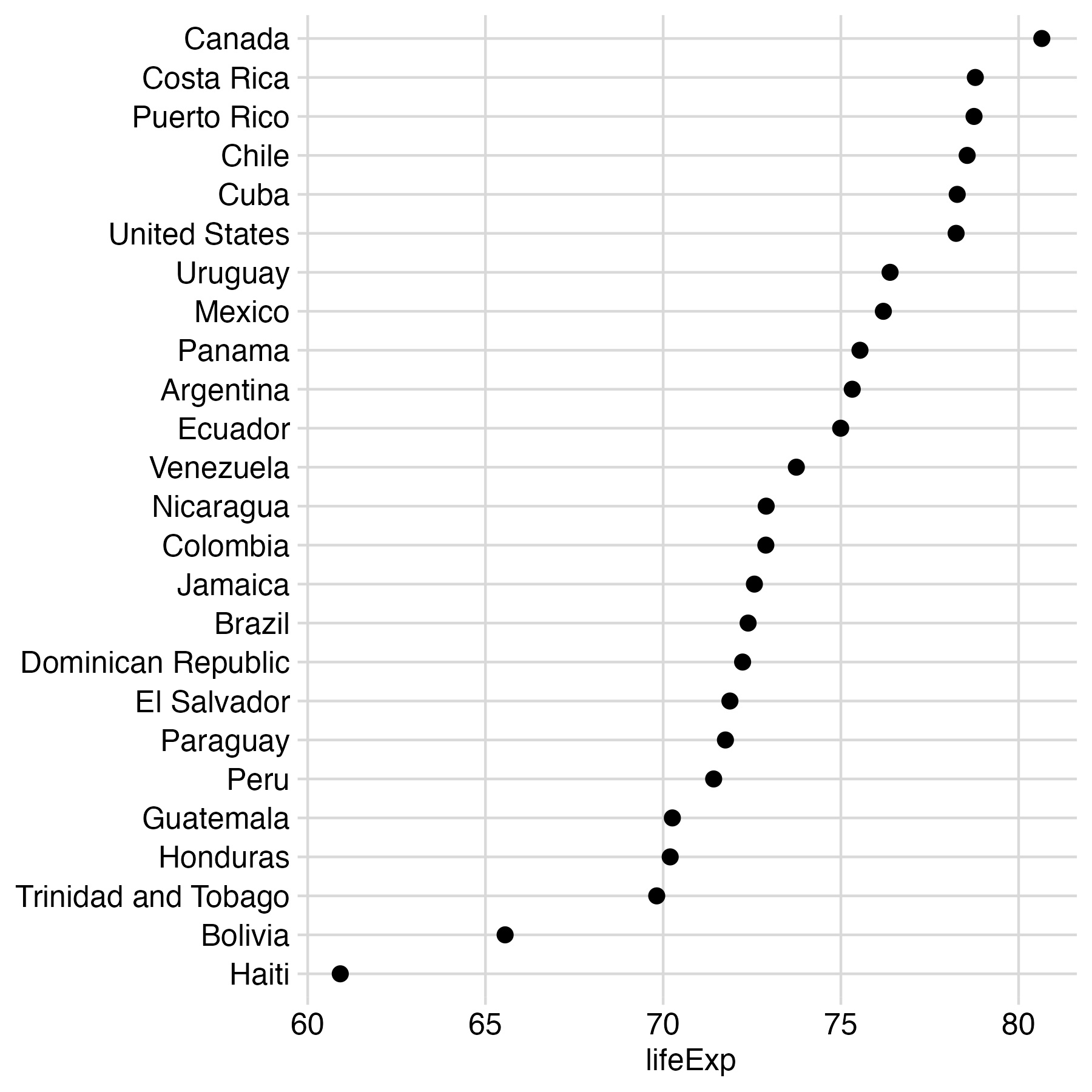
Exercise 3.2: Take your styled plot from Exercise 2.2 and save it as an image with ggsave().
p <- ggplot(diamonds, aes(price)) +
  geom_density(fill = "#0072B280") +
  facet_wrap(
    ~cut,
    axes = "all_x"
  ) +
  theme_minimal_grid(12) +
  scale_x_continuous(
    expand = c(0, 0)
  ) +
  scale_y_continuous(
    expand = expansion(mult = c(0, 0.05))
  ) +
  panel_border("gray40")

ggsave("plot_exercise3.2.png", p, width = 6, height = 4.5, bg = "white")
magick::image_read("plot_exercise3.2.png")