Generates a canvas onto which one can draw axis-like objects.
Source:R/axis_canvas.R
axis_canvas.RdThis function takes an existing ggplot2 plot and copies one or both of the axis into a new plot.
The main idea is to use this in conjunction with insert_xaxis_grob() or insert_yaxis_grob() to
draw custom axis-like objects or margin annotations. Importantly, while this function works for
both continuous and discrete scales, notice that discrete scales are converted into continuous scales
in the returned axis canvas. The levels of the discrete scale are placed at continuous values of
1, 2, 3, etc. See Examples for an example of how to convert a discrete scale into a continuous
scale.
axis_canvas(
  plot,
  axis = "y",
  data = NULL,
  mapping = aes(),
  xlim = NULL,
  ylim = NULL,
  coord_flip = FALSE
)
Arguments
- plot
The plot defining the x and/or y axis range for the axis canvas.
- axis
Specifies which axis to copy from
plot. Can be"x","y", or"xy".- data
(optional) Data to be displayed in this layer.
- mapping
(optional) Aesthetic mapping to be used in this layer.
- xlim
(optional) Vector of two numbers specifying the limits of the x axis. Ignored if the x axis is copied over from
plot.- ylim
(optional) Vector of two numbers specifying the limits of the y axis. Ignored if the y axis is copied over from
plot.- coord_flip
(optional) If
true, flips the coordinate system and applies x limits to the y axis and vice versa. Useful in combination with ggplot2'sggplot2::coord_flip()function.
Examples
# annotate line graphs with labels on the right
library(dplyr)
#>
#> Attaching package: ‘dplyr’
#> The following objects are masked from ‘package:stats’:
#>
#>     filter, lag
#> The following objects are masked from ‘package:base’:
#>
#>     intersect, setdiff, setequal, union
library(tidyr)
library(ggplot2)
theme_set(theme_half_open())
x <- seq(0, 10, .1)
d <- data.frame(x,
                linear = x,
                squared = x*x/5,
                cubed = x*x*x/25) %>%
  gather(fun, y, -x)

pmain <- ggplot(d, aes(x, y, group = fun)) + geom_line()  +
  scale_x_continuous(expand = c(0, 0))

paxis <- axis_canvas(pmain, axis = "y") +
  geom_text(data = filter(d, x == max(x)), aes(y = y, label = paste0(" ", fun)),
            x = 0, hjust = 0, vjust = 0.5)
ggdraw(insert_yaxis_grob(pmain, paxis, grid::unit(.25, "null")))


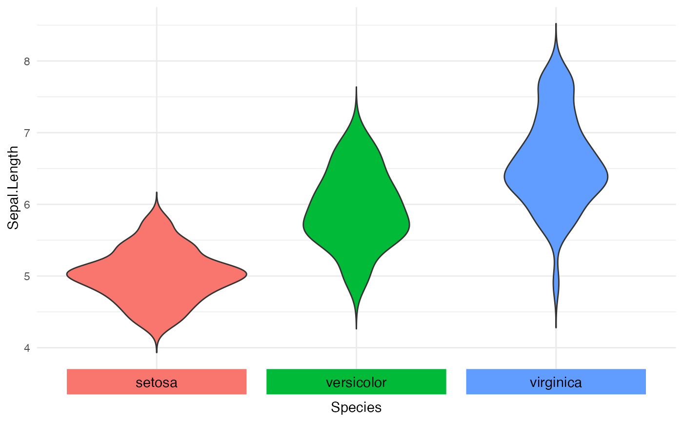
# discrete scale with integrated color legend
pmain <- ggplot(iris, aes(x = Species, y = Sepal.Length, fill = Species)) +
  geom_violin(trim = FALSE) + guides(fill = "none") +
  scale_x_discrete(labels = NULL) +
  theme_minimal()

label_data <- data.frame(x = 1:nlevels(iris$Species),
                         Species = levels(iris$Species))
paxis <- axis_canvas(pmain, axis = "x", data = label_data, mapping = aes(x = x)) +
  geom_tile(aes(fill = Species, y = 0.5), width = 0.9, height = 0.3) +
  geom_text(aes(label = Species, y = 0.5), hjust = 0.5, vjust = 0.5, size = 11/.pt)
ggdraw(insert_xaxis_grob(pmain, paxis, grid::unit(.07, "null"),
                         position = "bottom"))


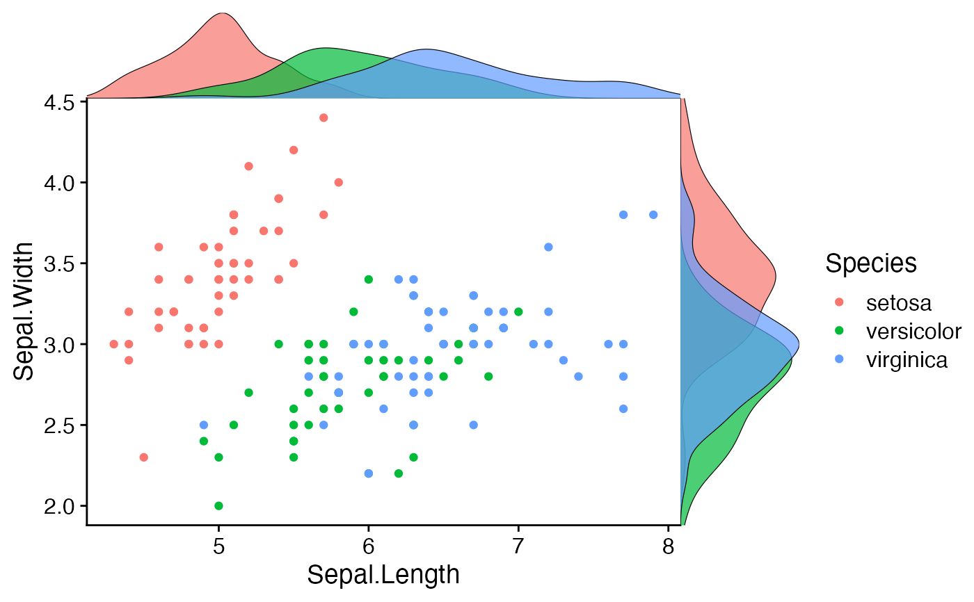
# add marginal density distributions to plot
pmain <- ggplot(iris, aes(x=Sepal.Length, y=Sepal.Width, color=Species)) + geom_point()

xdens <- axis_canvas(pmain, axis = "x") +
  geom_density(data=iris, aes(x=Sepal.Length, fill=Species), alpha=0.7, size=.2)
#> Warning: Using `size` aesthetic for lines was deprecated in ggplot2 3.4.0.
#> ℹ Please use `linewidth` instead.

# need to set `coord_flip = TRUE` if you plan to use `coord_flip()`
ydens <- axis_canvas(pmain, axis = "y", coord_flip = TRUE) +
  geom_density(data=iris, aes(x=Sepal.Width, fill=Species), alpha=0.7, size=.2) +
  coord_flip()

p1 <- insert_xaxis_grob(pmain, xdens, grid::unit(.2, "null"), position = "top")
p2 <- insert_yaxis_grob(p1, ydens, grid::unit(.2, "null"), position = "right")
ggdraw(p2)
