Evolution of movie lengths over time
Data from the IMDB, as provided in the ggplot2movies package.
library(ggplot2movies)

ggplot(movies[movies$year>1912,], aes(x = length, y = year, group = year)) +
  geom_density_ridges(scale = 10, linewidth = 0.25, rel_min_height = 0.03) +
  theme_ridges() +
  scale_x_continuous(limits = c(1, 200), expand = c(0, 0)) +
  scale_y_reverse(
    breaks = c(2000, 1980, 1960, 1940, 1920, 1900),
    expand = c(0, 0)
  ) +
  coord_cartesian(clip = "off")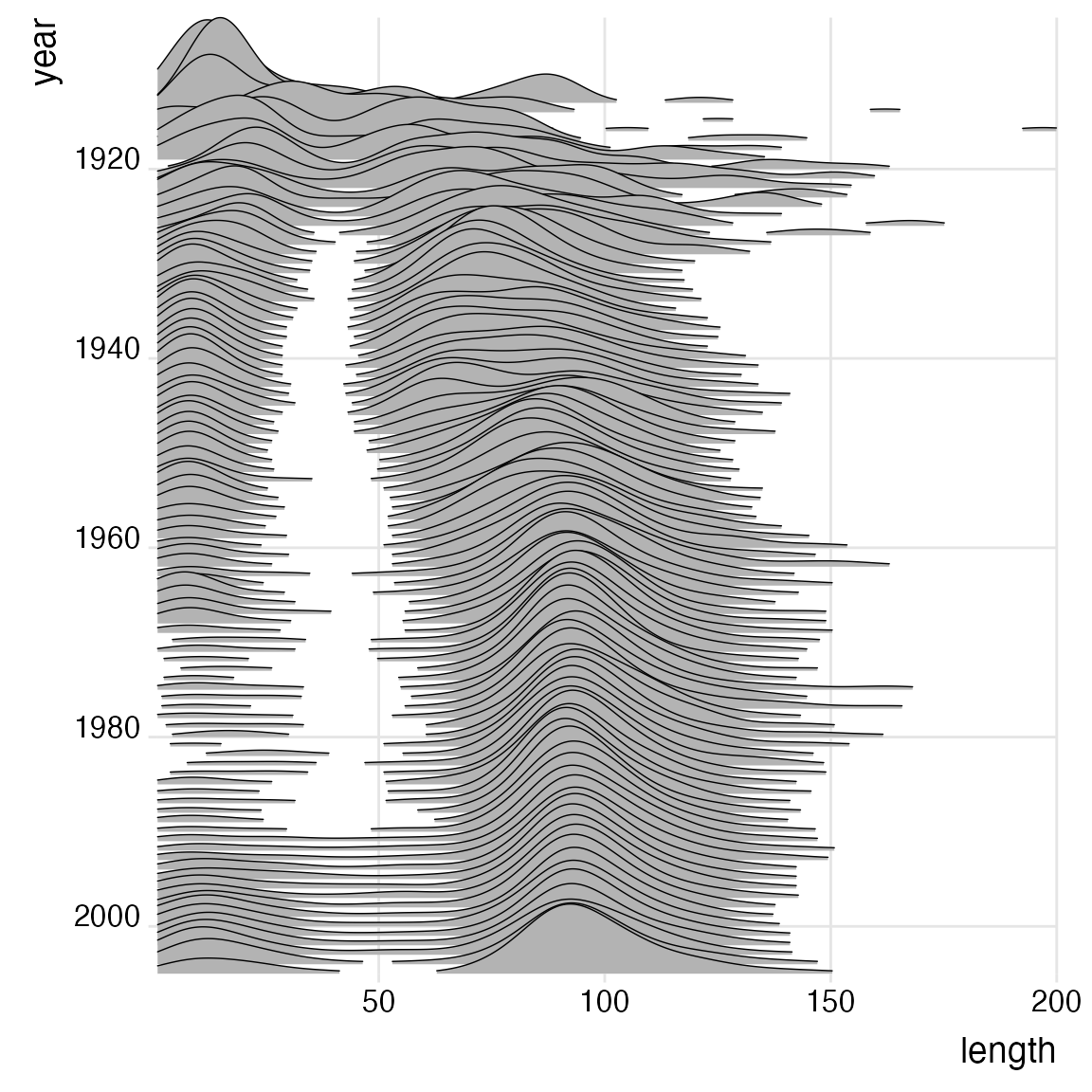
Results from Catalan regional elections, 1980-2015
Modified after a figure originally created by Marc Belzunces (@marcbeldata on Twitter).
library(dplyr)
library(forcats)

Catalan_elections %>%
  mutate(YearFct = fct_rev(as.factor(Year))) %>%
  ggplot(aes(y = YearFct)) +
  geom_density_ridges(
    aes(x = Percent, fill = paste(YearFct, Option)),
    alpha = .8, color = "white", from = 0, to = 100
  ) +
  labs(
    x = "Vote (%)",
    y = "Election Year",
    title = "Indy vs Unionist vote in Catalan elections",
    subtitle = "Analysis unit: municipalities (n = 949)",
    caption = "Marc Belzunces (@marcbeldata) | Source: Idescat"
  ) +
  scale_y_discrete(expand = c(0, 0)) +
  scale_x_continuous(expand = c(0, 0)) +
  scale_fill_cyclical(
    breaks = c("1980 Indy", "1980 Unionist"),
    labels = c(`1980 Indy` = "Indy", `1980 Unionist` = "Unionist"),
    values = c("#ff0000", "#0000ff", "#ff8080", "#8080ff"),
    name = "Option", guide = "legend"
  ) +
  coord_cartesian(clip = "off") +
  theme_ridges(grid = FALSE)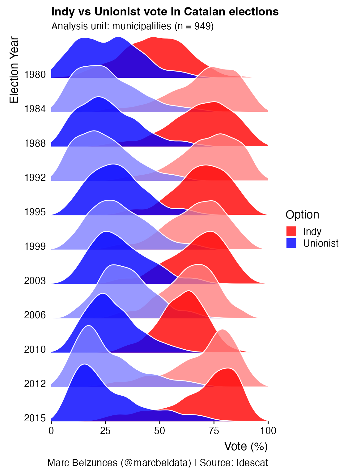
Temperatures in Lincoln, Nebraska
Modified from a blog post by Austin Wehrwein.
ggplot(lincoln_weather, aes(x = `Mean Temperature [F]`, y = Month, fill = stat(x))) +
  geom_density_ridges_gradient(scale = 3, rel_min_height = 0.01, gradient_lwd = 1.) +
  scale_x_continuous(expand = c(0, 0)) +
  scale_y_discrete(expand = expansion(mult = c(0.01, 0.25))) +
  scale_fill_viridis_c(name = "Temp. [F]", option = "C") +
  labs(
    title = 'Temperatures in Lincoln NE',
    subtitle = 'Mean temperatures (Fahrenheit) by month for 2016'
  ) +
  theme_ridges(font_size = 13, grid = TRUE) +
  theme(axis.title.y = element_blank())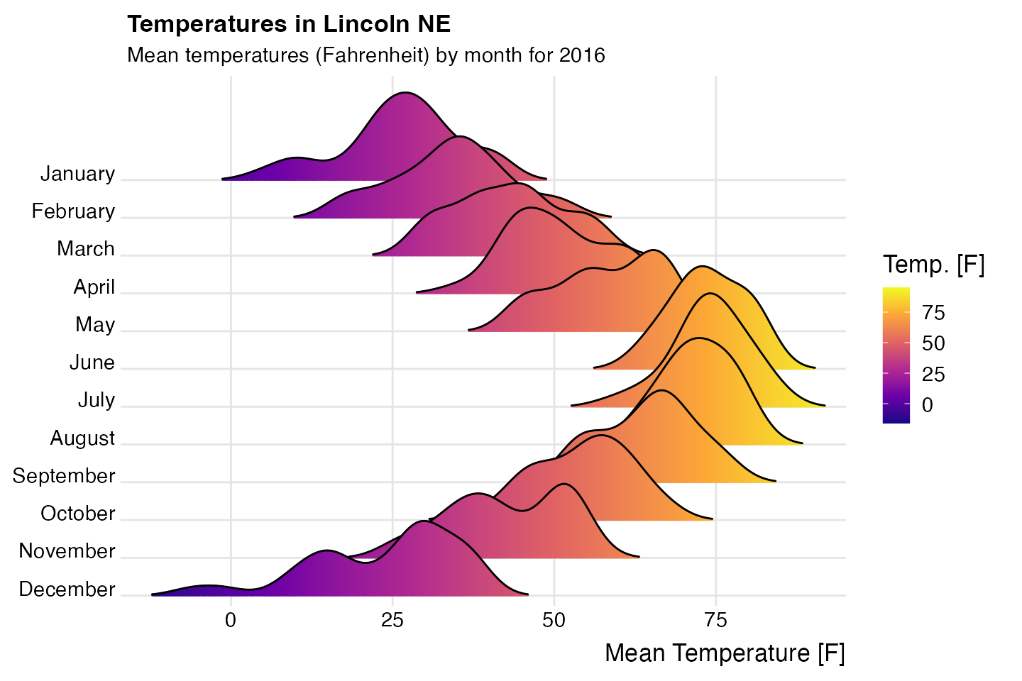
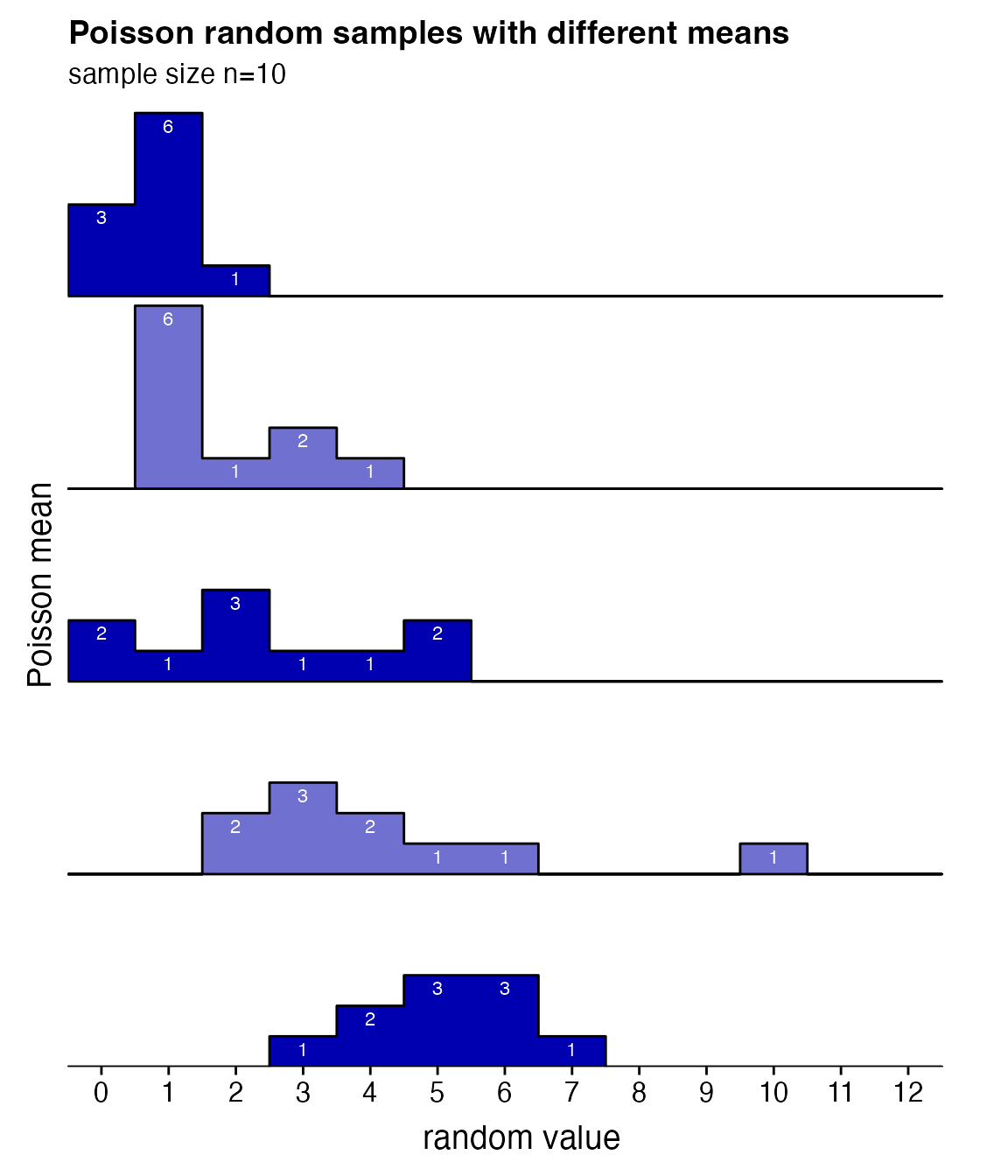
Visualization of Poisson random samples with different means
Inspired by a ggridges example by Noam Ross (twitter.com/noamross/status/888405434381545472).
# generate data
set.seed(1234)
pois_data <- data.frame(mean = rep(1:5, each = 10))
pois_data$group <- factor(pois_data$mean, levels = 5:1)
pois_data$value <- rpois(nrow(pois_data), pois_data$mean)

# make plot
ggplot(pois_data, aes(x = value, y = group, group = group)) +
  geom_density_ridges2(aes(fill = group), stat = "binline", binwidth = 1, scale = 0.95) +
  geom_text(
    stat = "bin",
    aes(
      y = group + 0.95*stat(count/max(count)),
      label = ifelse(stat(count) > 0, stat(count), "")
    ),
    vjust = 1.4, size = 3, color = "white", binwidth = 1
  ) +
  scale_x_continuous(
    breaks = c(0:12), limits = c(-.5, 13),
    expand = c(0, 0), name = "random value"
  ) +
  scale_y_discrete(
    expand = expansion(add = c(0, 1.)), name = "Poisson mean",
    labels = c("5.0", "4.0", "3.0", "2.0", "1.0")
  ) +
  scale_fill_cyclical(values = c("#0000B0", "#7070D0")) +
  labs(
    title = "Poisson random samples with different means",
    subtitle = "sample size n=10"
  ) +
  guides(y = "none") +
  theme_ridges(grid = FALSE) +
  theme(
    axis.title.x = element_text(hjust = 0.5),
    axis.title.y = element_text(hjust = 0.5)
  )
Height of Australian athletes
 ggplot(Aus_athletes, aes(x = height, y = sport, color = sex, point_color = sex, fill = sex)) +
  geom_density_ridges(
    jittered_points = TRUE, scale = .95, rel_min_height = .01,
    point_shape = "|", point_size = 3, linewidth = 0.25,
    position = position_points_jitter(height = 0)
  ) +
  scale_y_discrete(expand = c(0, 0)) +
  scale_x_continuous(expand = c(0, 0), name = "height [cm]") +
  scale_fill_manual(values = c("#D55E0050", "#0072B250"), labels = c("female", "male")) +
  scale_color_manual(values = c("#D55E00", "#0072B2"), guide = "none") +
  scale_discrete_manual("point_color", values = c("#D55E00", "#0072B2"), guide = "none") +
  coord_cartesian(clip = "off") +
  guides(fill = guide_legend(
    override.aes = list(
      fill = c("#D55E00A0", "#0072B2A0"),
      color = NA, point_color = NA)
    )
  ) +
  ggtitle("Height in Australian athletes") +
  theme_ridges(center = TRUE)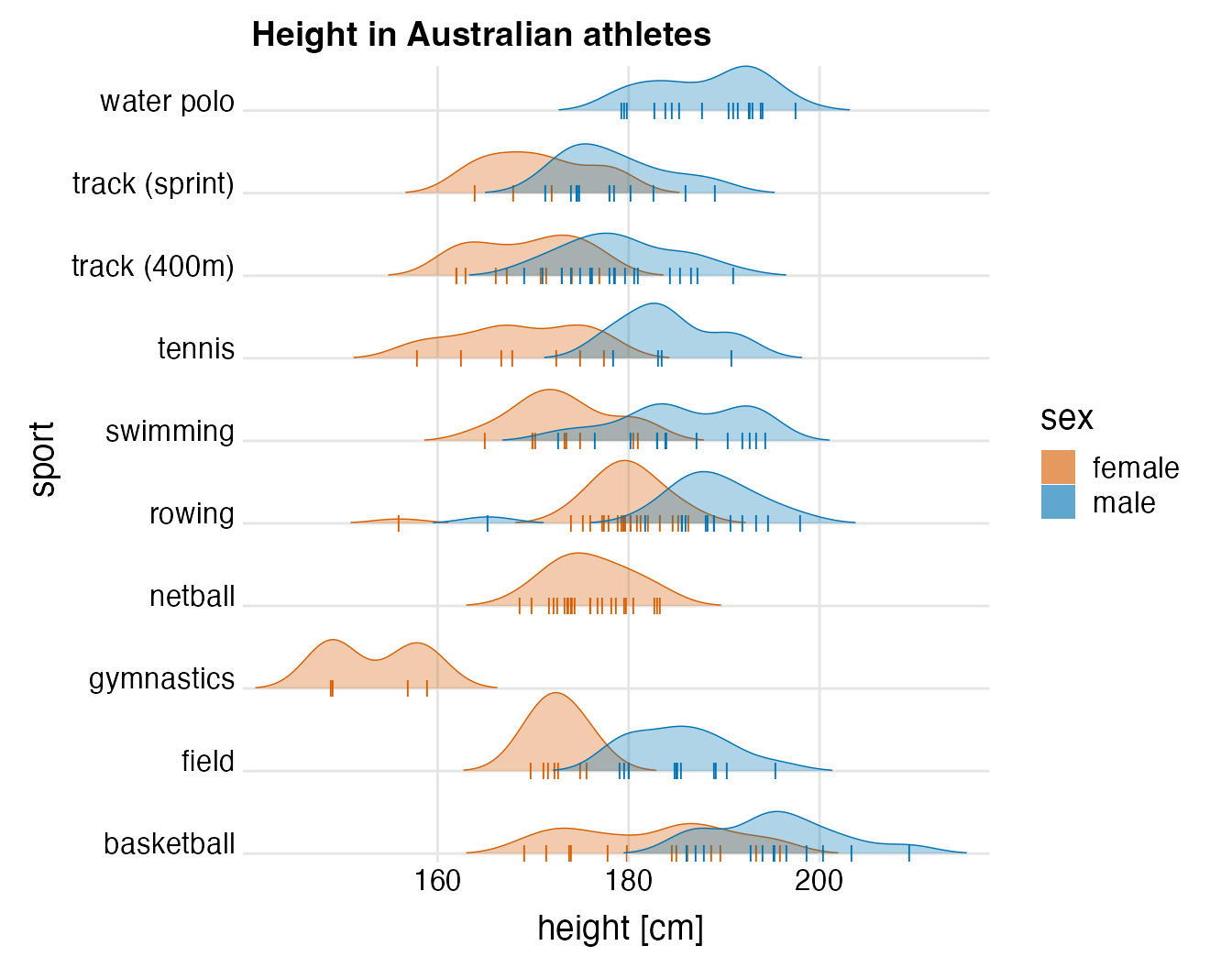
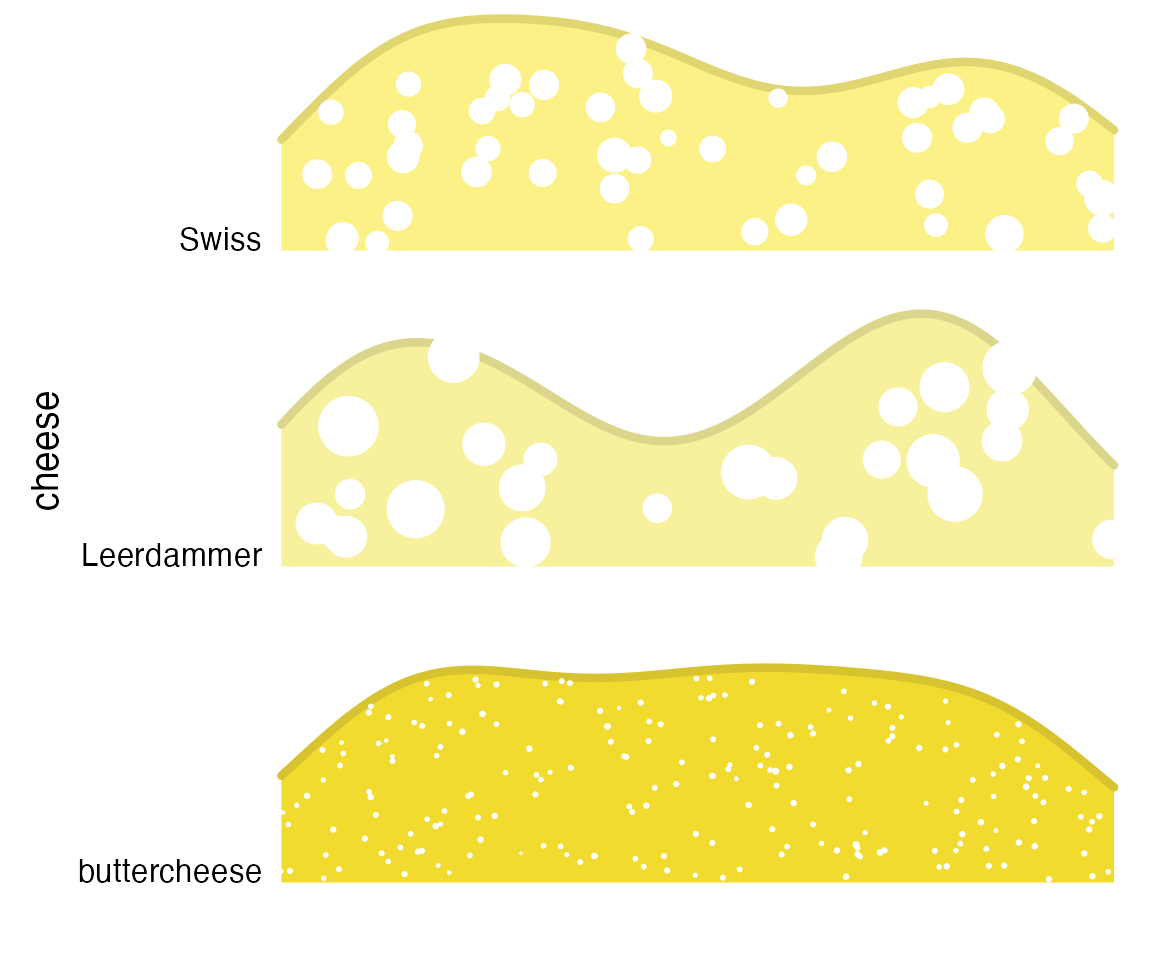
A cheese plot
Inspired by a tweet by Leonard Kiefer (twitter.com/lenkiefer/status/932237461337575429).
set.seed(423)
n1 <- 200
n2 <- 25
n3 <- 50
cols <- c('#F2DB2F', '#F7F19E', '#FBF186')
cols_dark <- c("#D7C32F", "#DBD68C", "#DFD672")
cheese <- data.frame(
  cheese = c(rep("buttercheese", n1), rep("Leerdammer", n2), rep("Swiss", n3)),
  x = c(runif(n1), runif(n2), runif(n3)),
  size = c(
    rnorm(n1, mean = .1, sd = .01),
    rnorm(n2, mean = 9, sd = 3),
    rnorm(n3, mean = 3, sd = 1)
  )
)
ggplot(cheese, aes(x = x, point_size = size, y = cheese, fill = cheese, color = cheese)) +
  geom_density_ridges(
    jittered_points = TRUE, point_color="white", scale = .8, rel_min_height = .2,
    linewidth = 1.5
  ) +
  scale_y_discrete(expand = c(0, 0)) +
  scale_x_continuous(limits = c(0, 1), expand = c(0, 0), name = "", breaks = NULL) +
  scale_point_size_continuous(range = c(0.01, 10), guide = "none") +
  scale_fill_manual(values = cols, guide = "none") +
  scale_color_manual(values = cols_dark, guide = "none") +
  coord_cartesian(clip = "off") +
  theme_ridges(grid = FALSE, center = TRUE)