For this example, we will use the following packages.
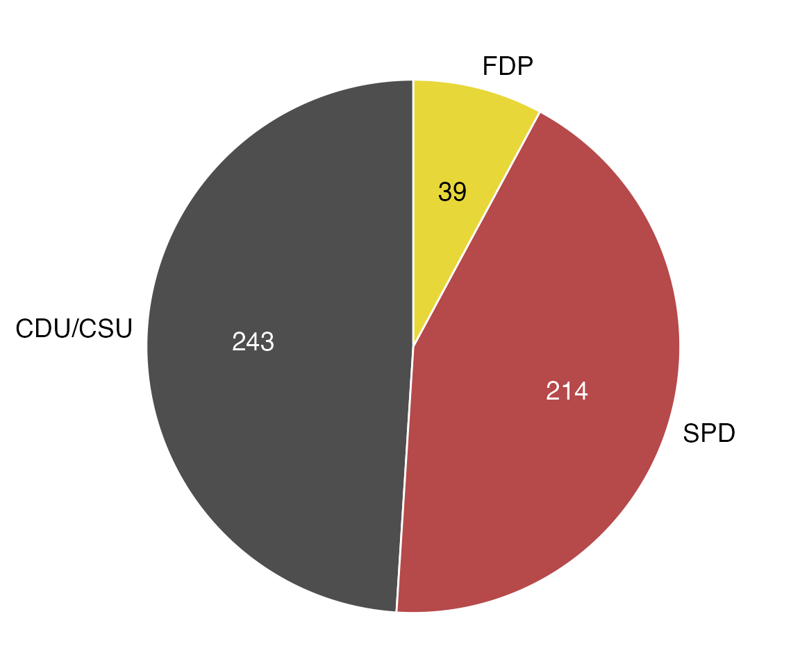
The dataset is provided as practicalgg::bundestag. Let’s look at it in table form and as a basic pie-chart.
## # A tibble: 3 x 3
##   party   seats colors
##   <chr>   <dbl> <chr>
## 1 CDU/CSU   243 #4E4E4E
## 2 SPD       214 #B6494A
## 3 FDP        39 #E7D739
ggplot(bundestag, aes(x = 1, y = seats, fill = party)) +
  geom_col() +
  coord_polar(theta = "y")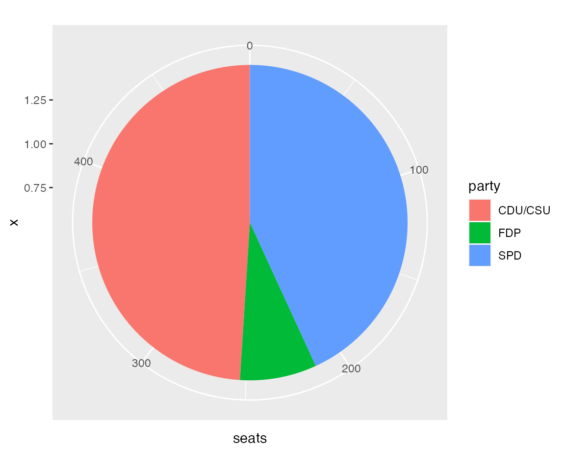
We could try to style this pie chart to make it look the way we want, but I usually find it easier to draw pie charts in cartesian coordinates, using geom_arc_bar() from ggforce. This requires a little more data preparation up front but gives much more predictable results on the back end.
bund_pie <- bundestag %>%
  arrange(seats) %>%
  mutate(
    end_angle = 2*pi*cumsum(seats)/sum(seats),   # ending angle for each pie slice
    start_angle = lag(end_angle, default = 0),   # starting angle for each pie slice
    mid_angle = 0.5*(start_angle + end_angle),   # middle of each pie slice, for the text label
    # horizontal and vertical justifications depend on whether we're to the left/right
    # or top/bottom of the pie
    hjust = ifelse(mid_angle > pi, 1, 0),
    vjust = ifelse(mid_angle < pi/2 | mid_angle > 3*pi/2, 0, 1)
  )

bund_pie
## # A tibble: 3 x 8
## party seats colors end_angle start_angle mid_angle hjust vjust
## <chr> <dbl> <chr> <dbl> <dbl> <dbl> <dbl> <dbl>
## 1 FDP 39 #E7D739 0.494 0 0.247 0 0
## 2 SPD 214 #B6494A 3.20 0.494 1.85 0 1
## 3 CDU/CSU 243 #4E4E4E 6.28 3.20 4.74 1 0
# radius of the pie and radius for outside and inside labels
rpie <- 1
rlabel_out <- 1.05 * rpie
rlabel_in <- 0.6 * rpie

ggplot(bund_pie) +
  geom_arc_bar(
    aes(
      x0 = 0, y0 = 0, r0 = 0, r = rpie,
      start = start_angle, end = end_angle, fill = party
    )
  ) +
  coord_fixed()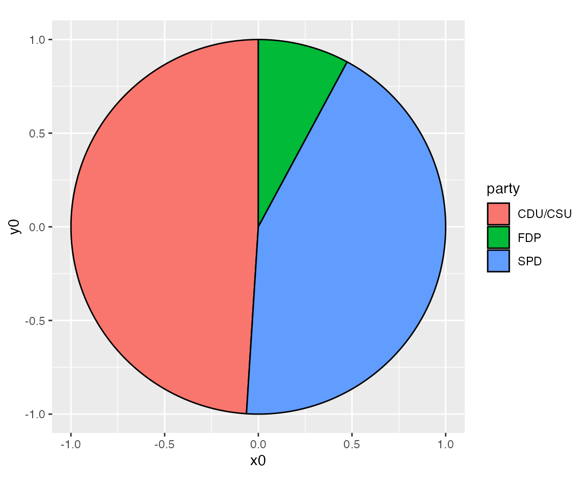
Next we add labels representing the numbers of seats for each party.
ggplot(bund_pie) +
  geom_arc_bar(
    aes(
      x0 = 0, y0 = 0, r0 = 0, r = rpie,
      start = start_angle, end = end_angle, fill = party
    )
  ) +
  geom_text(
    aes(
      x = rlabel_in * sin(mid_angle),
      y = rlabel_in * cos(mid_angle),
      label = seats
    ),
    size = 14/.pt # use 14 pt font size
  ) +
  coord_fixed()
And we provide labels for the parties outside of the pie.
ggplot(bund_pie) +
  geom_arc_bar(
    aes(
      x0 = 0, y0 = 0, r0 = 0, r = rpie,
      start = start_angle, end = end_angle, fill = party
    )
  ) +
  geom_text(
    aes(
      x = rlabel_in * sin(mid_angle),
      y = rlabel_in * cos(mid_angle),
      label = seats
    ),
    size = 14/.pt
  ) +
  geom_text(
    aes(
      x = rlabel_out * sin(mid_angle),
      y = rlabel_out * cos(mid_angle),
      label = party,
      hjust = hjust, vjust = vjust
    ),
    size = 14/.pt
  ) +
  coord_fixed()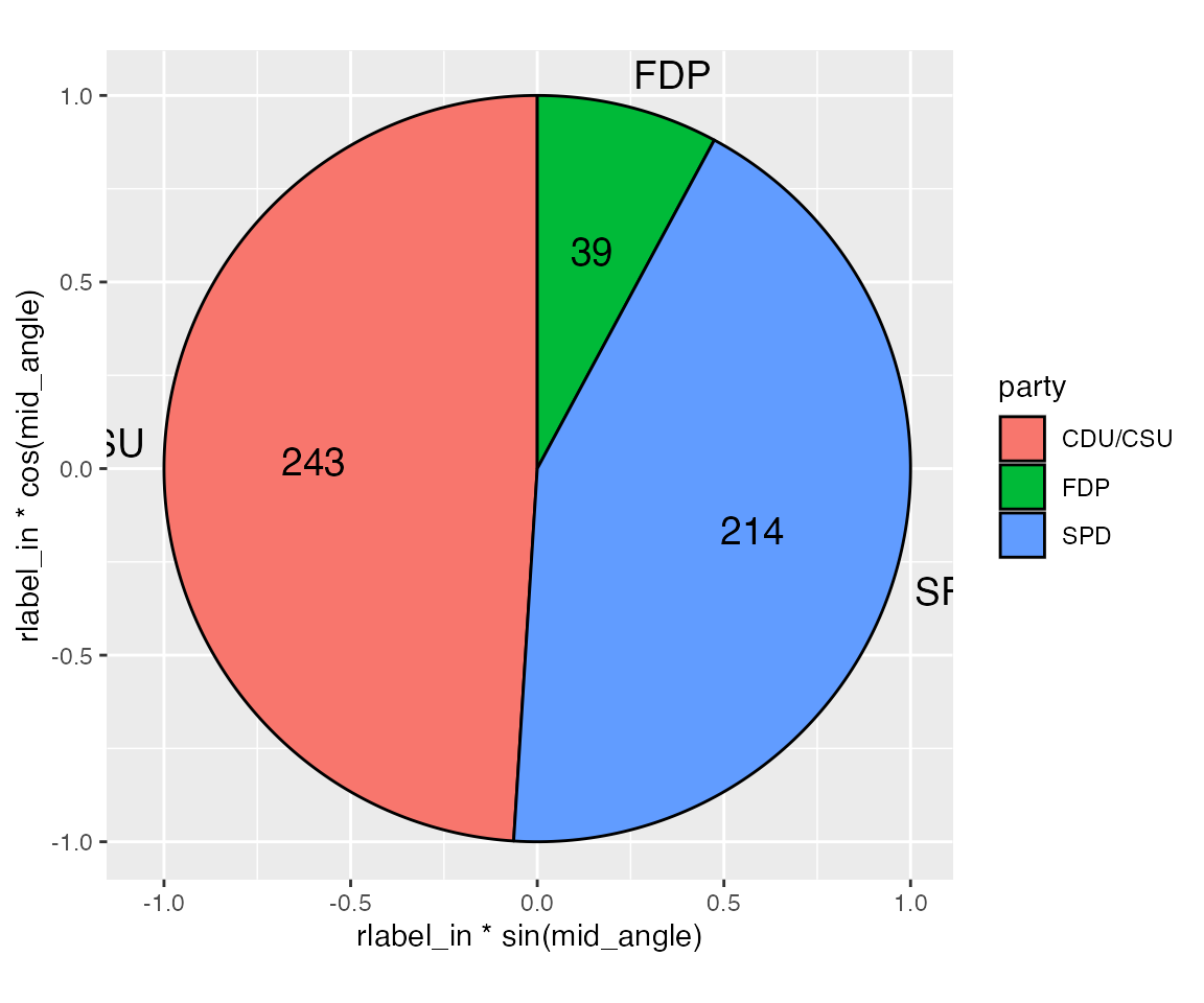
We see that we need to make some space for the outside labels. We can do that by manually setting the scale limits and expansion.
ggplot(bund_pie) +
  geom_arc_bar(
    aes(
      x0 = 0, y0 = 0, r0 = 0, r = rpie,
      start = start_angle, end = end_angle, fill = party
    )
  ) +
  geom_text(
    aes(
      x = rlabel_in * sin(mid_angle),
      y = rlabel_in * cos(mid_angle),
      label = seats
    ),
    size = 14/.pt
  ) +
  geom_text(
    aes(
      x = rlabel_out * sin(mid_angle),
      y = rlabel_out * cos(mid_angle),
      label = party,
      hjust = hjust, vjust = vjust
    ),
    size = 14/.pt
  ) +
  scale_x_continuous(
    name = NULL,
    limits = c(-1.5, 1.4),
    expand = c(0, 0)
  ) +
  scale_y_continuous(
    name = NULL,
    limits = c(-1.05, 1.15),
    expand = c(0, 0)
  ) +
  coord_fixed()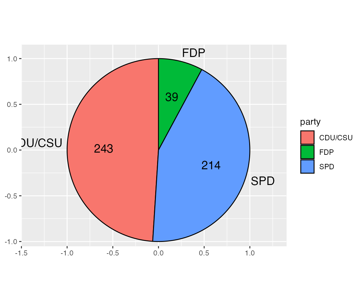
This plot shows how using a cartesian coordinate system is helpful. We can see exactly where elements lie and how we need to expand the limits to fully show all the labels. The CDU/CSU label remains partially obscured at this point, but this will be fixed later as we remove the legend and axis labels, resulting in slightly more space for the pie chart itself as well as the labels.
Next we change the pie colors. The dataset provides appropriate party colors, and we use those directly with scale_fill_identity(). Note that this scale eliminates the legend. We don’t need a legend anyways, because we have direct labeled the pie slices.
ggplot(bund_pie) +
  geom_arc_bar(
    aes(
      x0 = 0, y0 = 0, r0 = 0, r = rpie,
      start = start_angle, end = end_angle, fill = colors
    )
  ) +
  geom_text(
    aes(
      x = rlabel_in * sin(mid_angle),
      y = rlabel_in * cos(mid_angle),
      label = seats
    ),
    size = 14/.pt
  ) +
  geom_text(
    aes(
      x = rlabel_out * sin(mid_angle),
      y = rlabel_out * cos(mid_angle),
      label = party,
      hjust = hjust, vjust = vjust
    ),
    size = 14/.pt
  ) +
  scale_x_continuous(
    name = NULL,
    limits = c(-1.5, 1.4),
    expand = c(0, 0)
  ) +
  scale_y_continuous(
    name = NULL,
    limits = c(-1.05, 1.15),
    expand = c(0, 0)
  ) +
  scale_fill_identity() +
  coord_fixed()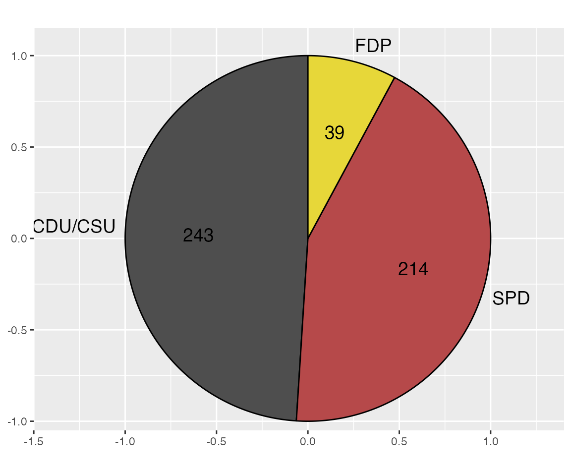
The black color for the text labels doesn’t work well on top of the dark fill colors, and the black outline also looks overbearing, so we’ll change those colors to white.
ggplot(bund_pie) +
  geom_arc_bar(
    aes(
      x0 = 0, y0 = 0, r0 = 0, r = rpie,
      start = start_angle, end = end_angle, fill = colors
    ),
    color = "white"
  ) +
  geom_text(
    aes(
      x = rlabel_in * sin(mid_angle),
      y = rlabel_in * cos(mid_angle),
      label = seats
    ),
    size = 14/.pt,
    color = c("black", "white", "white")
  ) +
  geom_text(
    aes(
      x = rlabel_out * sin(mid_angle),
      y = rlabel_out * cos(mid_angle),
      label = party,
      hjust = hjust, vjust = vjust
    ),
    size = 14/.pt
  ) +
  scale_x_continuous(
    name = NULL,
    limits = c(-1.5, 1.4),
    expand = c(0, 0)
  ) +
  scale_y_continuous(
    name = NULL,
    limits = c(-1.05, 1.15),
    expand = c(0, 0)
  ) +
  scale_fill_identity() +
  coord_fixed()
Finally, we need to apply a theme that removes the background grid and axes
ggplot(bund_pie) +
  geom_arc_bar(
    aes(
      x0 = 0, y0 = 0, r0 = 0, r = rpie,
      start = start_angle, end = end_angle, fill = colors
    ),
    color = "white"
  ) +
  geom_text(
    aes(
      x = rlabel_in * sin(mid_angle),
      y = rlabel_in * cos(mid_angle),
      label = seats
    ),
    size = 14/.pt,
    color = c("black", "white", "white")
  ) +
  geom_text(
    aes(
      x = rlabel_out * sin(mid_angle),
      y = rlabel_out * cos(mid_angle),
      label = party,
      hjust = hjust, vjust = vjust
    ),
    size = 14/.pt
  ) +
  scale_x_continuous(
    name = NULL,
    limits = c(-1.5, 1.4),
    expand = c(0, 0)
  ) +
  scale_y_continuous(
    name = NULL,
    limits = c(-1.05, 1.15),
    expand = c(0, 0)
  ) +
  scale_fill_identity() +
  coord_fixed() +
  theme_map()