For this example, we will use the following packages.
The dataset is provided as practicalgg::happy. Let’s look at it in table form and as basic density plots.
data_health <- practicalgg::happy %>%
  select(age, health) %>%
  na.omit() %>%
  mutate(health = fct_rev(health)) # revert factor order

data_health
## # A tibble: 38,361 x 2
## age health
## <dbl> <fct>
## 1 23 good
## 2 70 fair
## 3 48 excellent
## 4 27 good
## 5 61 good
## 6 26 good
## 7 28 excellent
## 8 27 good
## 9 21 excellent
## 10 30 fair
## # … with 38,351 more rows
ggplot(data_health, aes(x = age, y = stat(count))) +
  geom_density(fill = "lightblue") +
  facet_wrap(~health, nrow = 1)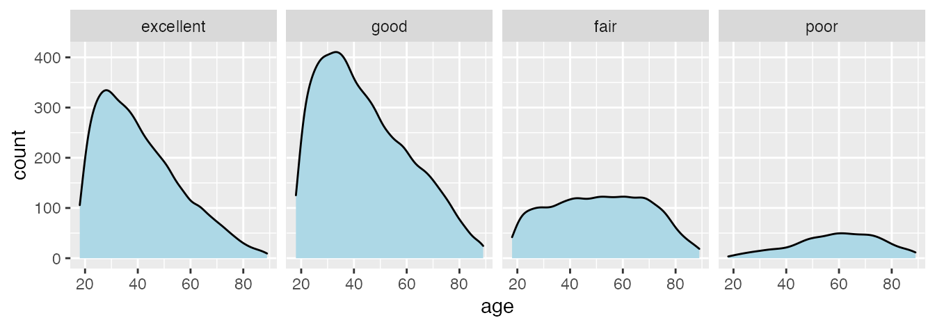
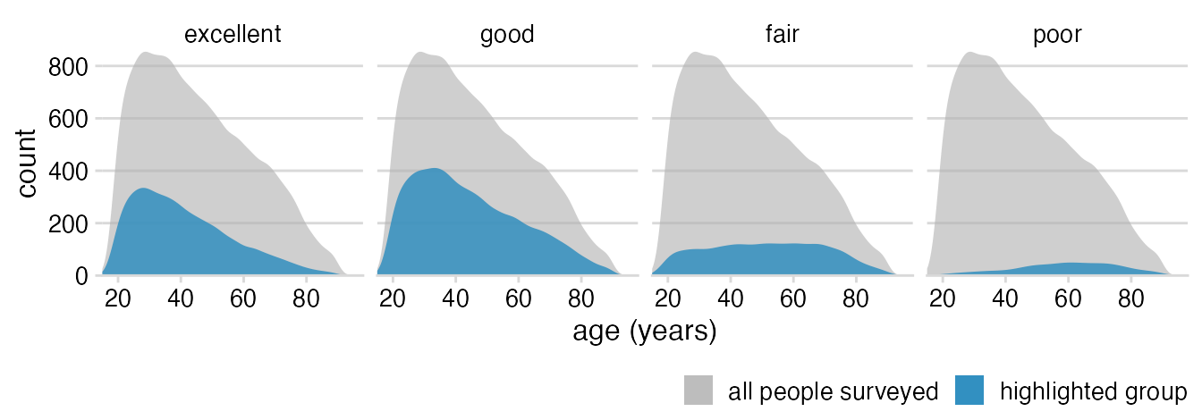
Add the overall distribution as a background.
ggplot(data_health, aes(x = age, y = stat(count))) +
  # we add a density layer that uses the data without the column
  # by which we are faceting; this places the full dataset into
  # each facet
  geom_density(
    data = select(data_health, -health),
    aes(fill = "all people surveyed"),
  ) +
  geom_density(aes(fill = "highlighted group")) +
  facet_wrap(~health, nrow = 1)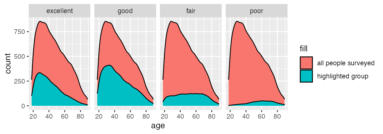
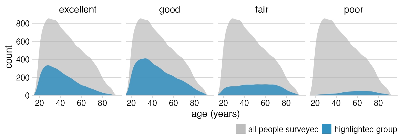
Define the scales.
ggplot(data_health, aes(x = age, y = stat(count))) +
  geom_density(
    data = select(data_health, -health),
    aes(fill = "all people surveyed"),
  ) +
  geom_density(aes(fill = "highlighted group")) +
  scale_x_continuous(
    name = "age (years)",
    limits = c(15, 98),
    expand = c(0, 0)
  ) +
  scale_y_continuous(
    name = "count",
    expand = c(0, 0)
  ) +
  scale_fill_manual(
    values = c("#b3b3b3a0", "#2b8cbed0"),
    name = NULL,
    guide = guide_legend(direction = "horizontal")
  ) +
  facet_wrap(~health, nrow = 1)
Basic theme; move legend to bottom; remove outline around densities.
ggplot(data_health, aes(x = age, y = stat(count))) +
  geom_density(
    data = select(data_health, -health),
    aes(fill = "all people surveyed"),
    color = NA
  ) +
  geom_density(aes(fill = "highlighted group"), color = NA) +
  scale_x_continuous(
    name = "age (years)",
    limits = c(15, 98),
    expand = c(0, 0)
  ) +
  scale_y_continuous(
    name = "count",
    expand = c(0, 0)
  ) +
  scale_fill_manual(
    values = c("#b3b3b3a0", "#2b8cbed0"),
    name = NULL,
    guide = guide_legend(direction = "horizontal")
  ) +
  facet_wrap(~health, nrow = 1) +
  theme_minimal_hgrid(12) +
  theme(
    legend.position = "bottom",
    legend.justification = "right"
  )
Theme tweaks: Larger strip labels, move legend closer to plot, adjust horizontal legend spacing.
ggplot(data_health, aes(x = age, y = stat(count))) +
  geom_density(
    data = select(data_health, -health),
    aes(fill = "all people surveyed"),
    color = NA
  ) +
  geom_density(aes(fill = "highlighted group"), color = NA) +
  scale_x_continuous(
    name = "age (years)",
    limits = c(15, 98),
    expand = c(0, 0)
  ) +
  scale_y_continuous(
    name = "count",
    expand = c(0, 0)
  ) +
  scale_fill_manual(
    values = c("#b3b3b3a0", "#2b8cbed0"),
    name = NULL,
    guide = guide_legend(direction = "horizontal")
  ) +
  facet_wrap(~health, nrow = 1) +
  theme_minimal_hgrid(12) +
  theme(
    strip.text = element_text(size = 12, margin = margin(0, 0, 6, 0, "pt")),
    legend.position = "bottom",
    legend.justification = "right",
    legend.margin = margin(6, 0, 1.5, 0, "pt"),
    legend.spacing.x = grid::unit(3, "pt"),
    legend.spacing.y = grid::unit(0, "pt"),
    legend.box.spacing = grid::unit(0, "pt")
  )
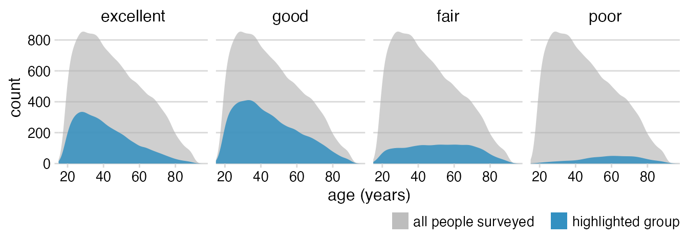
Remove axis line, add spacing between legend items.
ggplot(data_health, aes(x = age, y = stat(count))) +
  geom_density(
    data = select(data_health, -health),
    # a simple workaround to a limitation in ggplot2:
    # add a few spaces at the end of the legend text
    # to space out the legend items
    aes(fill = "all people surveyed   "),
    color = NA
  ) +
  geom_density(aes(fill = "highlighted group"), color = NA) +
  scale_x_continuous(
    name = "age (years)",
    limits = c(15, 98),
    expand = c(0, 0)
  ) +
  scale_y_continuous(
    name = "count",
    expand = c(0, 0)
  ) +
  scale_fill_manual(
    values = c("#b3b3b3a0", "#2b8cbed0"),
    name = NULL,
    guide = guide_legend(direction = "horizontal")
  ) +
  facet_wrap(~health, nrow = 1) +
  theme_minimal_hgrid(12) +
  theme(
    axis.line = element_blank(),
    strip.text = element_text(size = 12, margin = margin(0, 0, 6, 0, "pt")),
    legend.position = "bottom",
    legend.justification = "right",
    legend.margin = margin(6, 0, 1.5, 0, "pt"),
    legend.spacing.x = grid::unit(3, "pt"),
    legend.spacing.y = grid::unit(0, "pt"),
    legend.box.spacing = grid::unit(0, "pt")
  )
Turn off clipping.
ggplot(data_health, aes(x = age, y = stat(count))) +
  geom_density(
    data = select(data_health, -health),
    aes(fill = "all people surveyed   "),
    color = NA
  ) +
  geom_density(aes(fill = "highlighted group"), color = NA) +
  scale_x_continuous(
    name = "age (years)",
    limits = c(15, 98),
    expand = c(0, 0)
  ) +
  scale_y_continuous(
    name = "count",
    expand = c(0, 0)
  ) +
  scale_fill_manual(
    values = c("#b3b3b3a0", "#2b8cbed0"),
    name = NULL,
    guide = guide_legend(direction = "horizontal")
  ) +
  facet_wrap(~health, nrow = 1) +
  coord_cartesian(clip = "off") +
  theme_minimal_hgrid(12) +
  theme(
    axis.line = element_blank(),
    strip.text = element_text(size = 12, margin = margin(0, 0, 6, 0, "pt")),
    legend.position = "bottom",
    legend.justification = "right",
    legend.margin = margin(6, 0, 1.5, 0, "pt"),
    legend.spacing.x = grid::unit(3, "pt"),
    legend.spacing.y = grid::unit(0, "pt"),
    legend.box.spacing = grid::unit(0, "pt")
  )